Brand Identity Design.
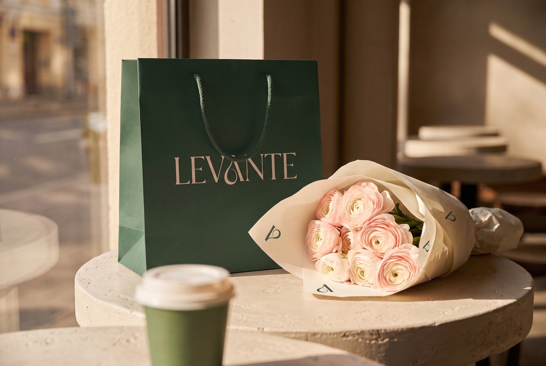
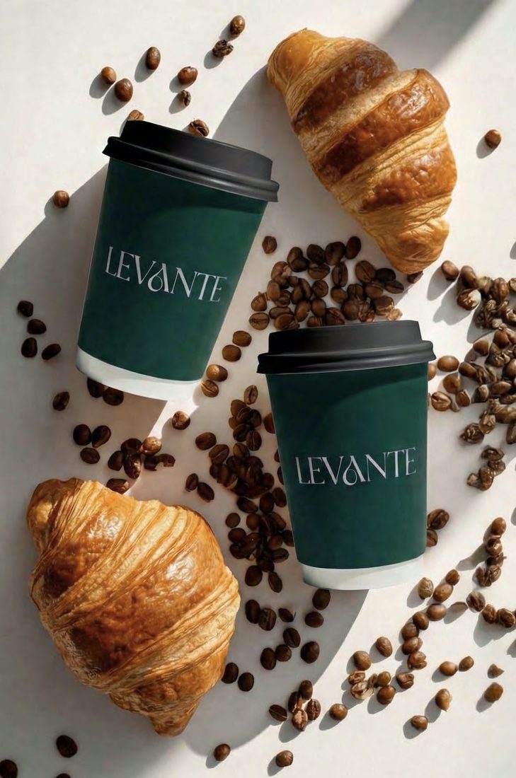
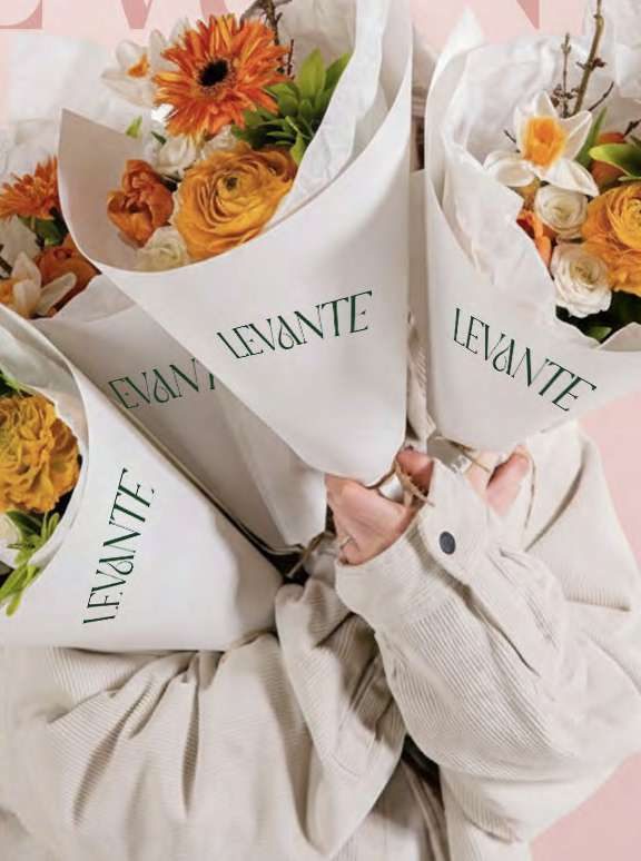
Levante — Coffee, Chocolates & Flowers
Three categories usually run as three businesses, sold across one counter. A wordmark with a teardrop hidden in the A, a palette held to a fixed proportion, and every application specified from the hot cup to the shopfront.

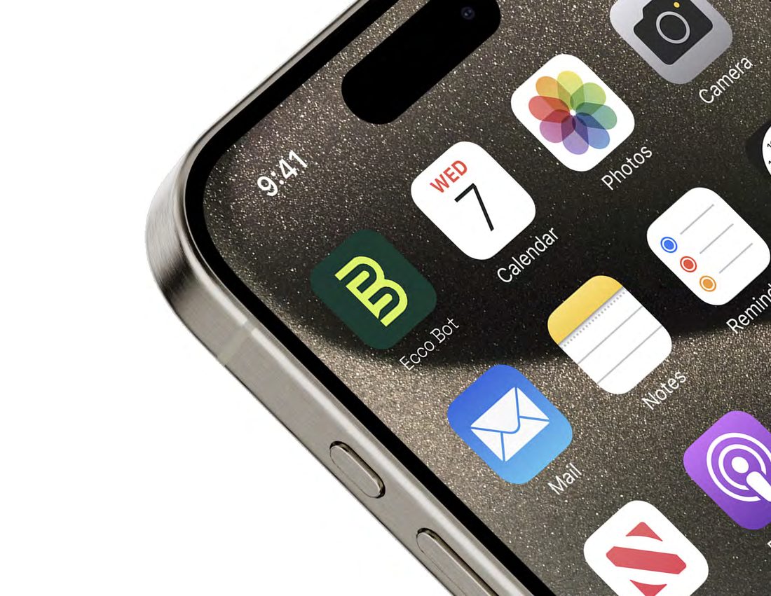
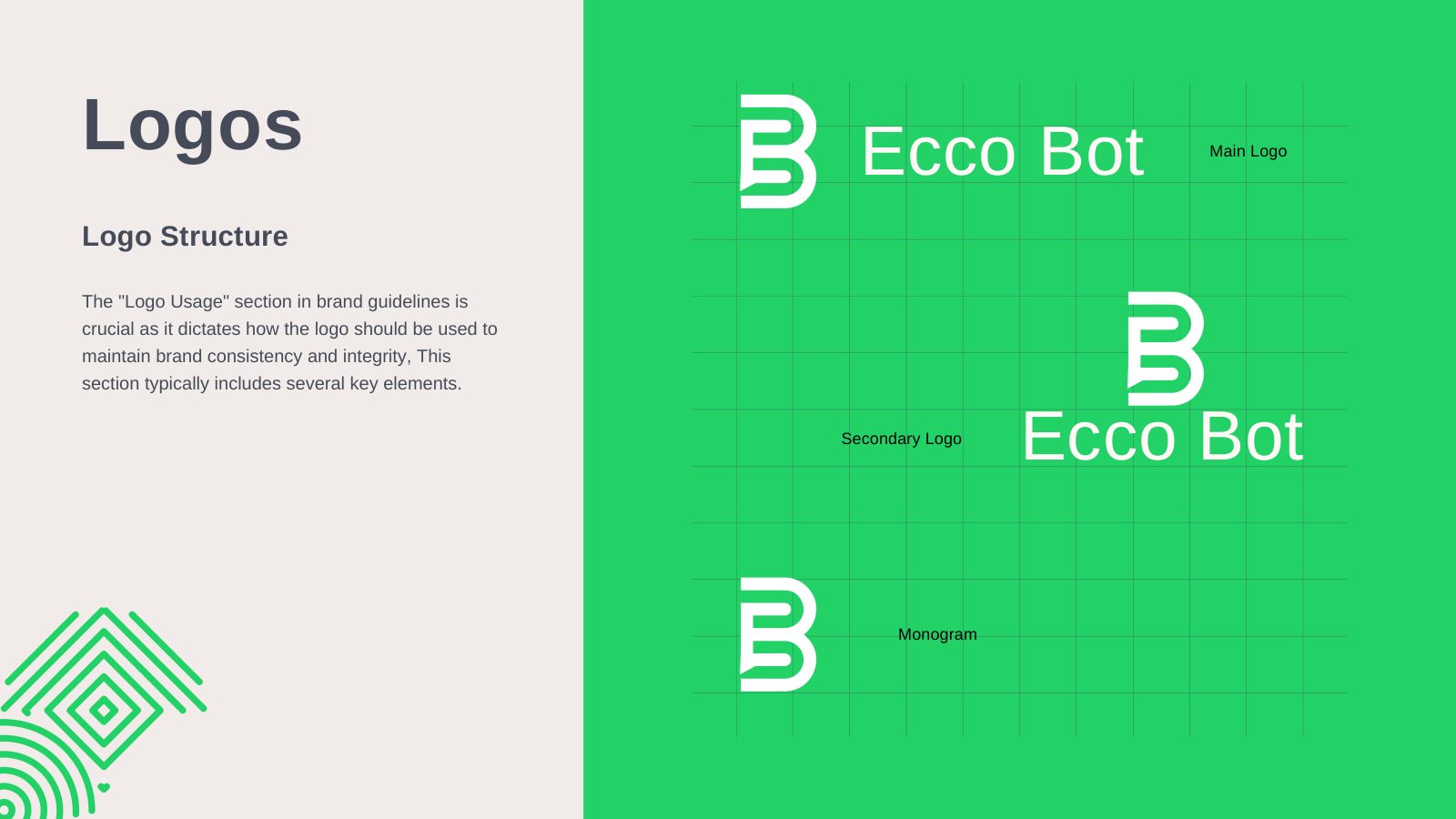
Ecco Bot — One Assistant, Every Channel
A messaging assistant that answers when nobody is free to. A monogram that reads as a B and a speech bubble at once, a green kept conversational rather than corporate, and accent colours barred from interface chrome so the product stays calm.

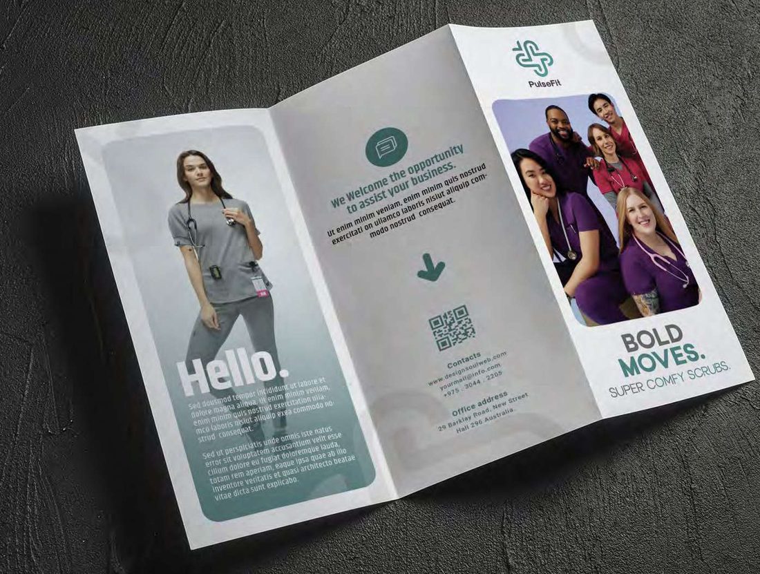
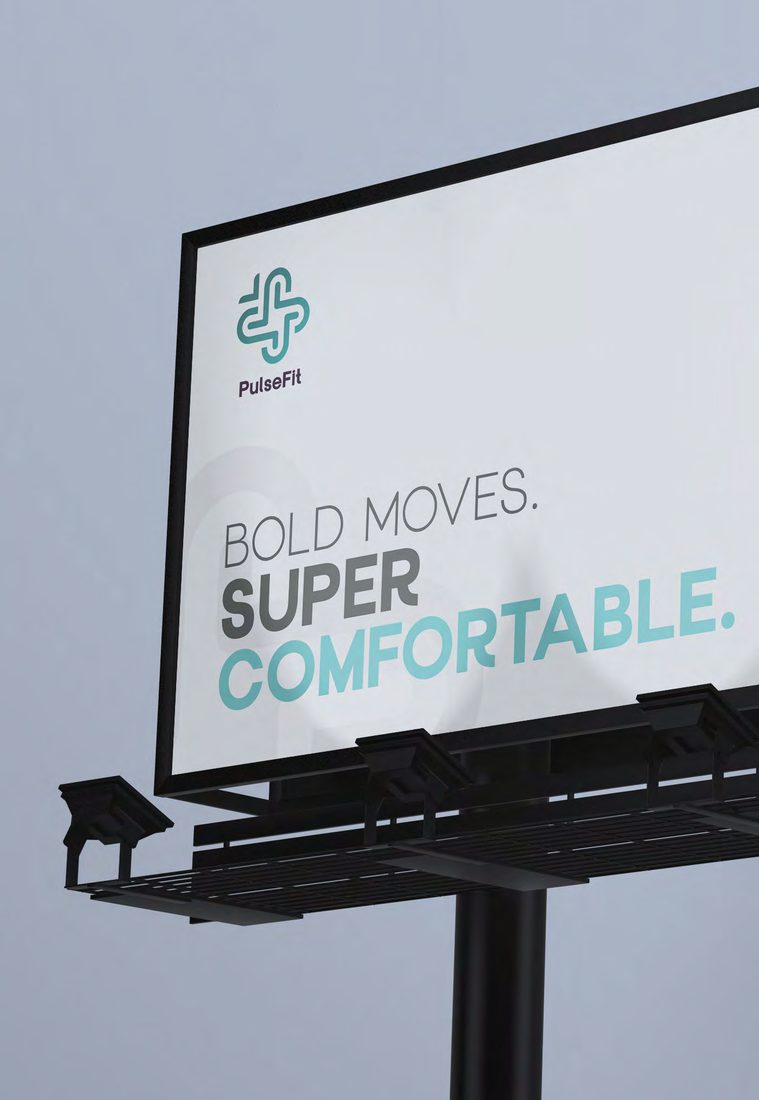
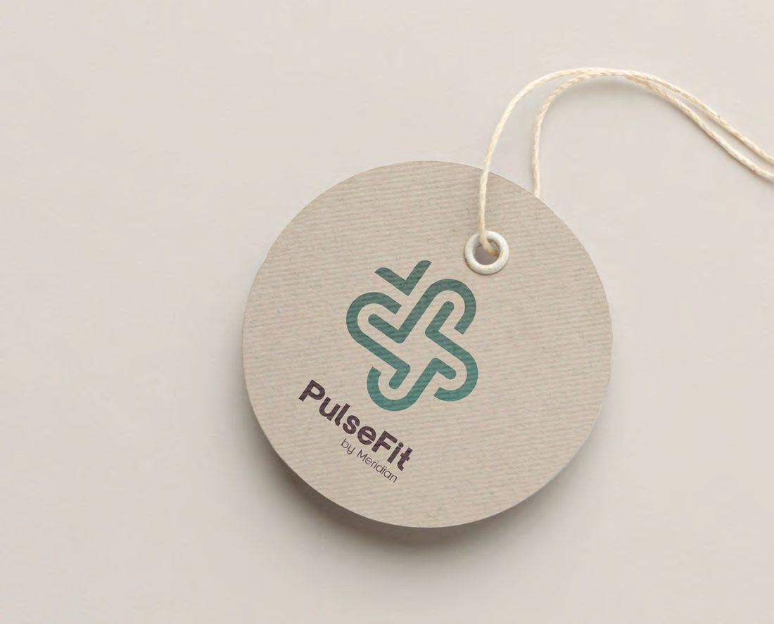
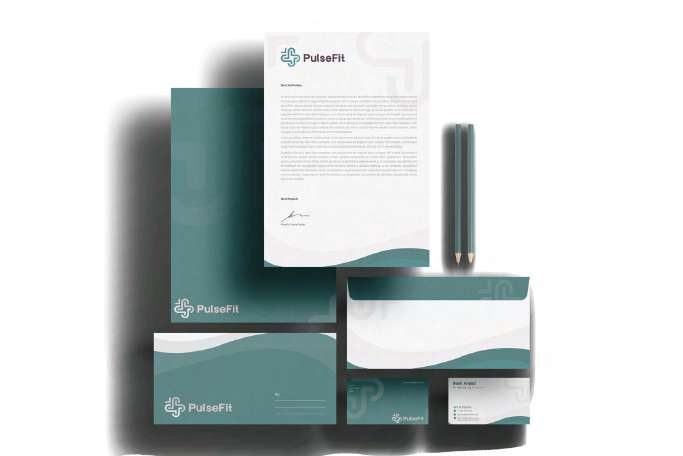
PulseFit — Scrubs, Uniforms & Workwear
Medical workwear sold as an experience rather than a garment. A symbol drawn as one continuous folded ribbon, four lockups each with a named job, and a tone of voice codified alongside the colour — assertive yet witty, still professional.

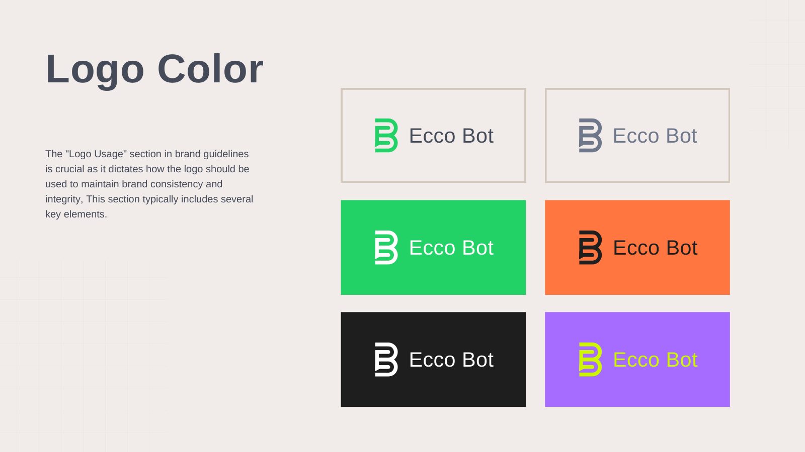
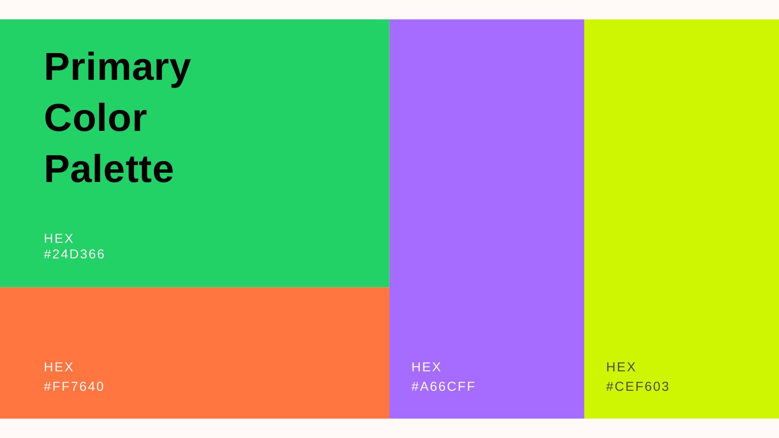
The work — identity systems specified tightly enough to be quoted from.
A brand identity is the system that keeps a company recognisable across every surface it appears on — the mark, the palette, the typography, the tone of voice and the rules governing all four. A logo is the smallest part of it and the part most often mistaken for the whole.
Three complete identities are documented above in full. Each was delivered as a guidelines document running to eighteen pages across seven or eight sections, specified closely enough that a supplier can quote from the book without calling us.
What an identity project delivers
- Positioning — the argument the brand makes, agreed before anything is drawn
- Symbol and lockups — each version with a named job, not a set of alternatives
- Colour with fixed proportion — not just which colours, but how much of each
- Typography — faces, weights, settings and the jobs each is allowed to do
- Tone of voice — how the brand writes, with examples of right and wrong
- Applications — packaging, garment, stationery, digital and out-of-home
- Asset index — every supplied file named by format and use
Rules exist so the brand survives other people
An identity is applied mostly by people who did not design it — printers, developers, franchisees, media agencies. PulseFit received four approved lockups, each with a named job: corporate for documents, product primary for garments and app icon, secondary for web headers, and the symbol alone for embroidery and badges. Naming the job removes the judgement call that causes drift.
Levante answers a harder problem — coffee, chocolates and flowers, three categories usually run as three businesses, sold across one counter and held together by a single system. Ecco Bot goes the other way: a monogram reading as a B and a speech bubble at once, with accent colours deliberately barred from interface chrome so the product stays calm.
Brand identity questions — what you receive.
What is included in a brand identity project?
A full identity covers positioning, the symbol and lockups, colour with fixed proportions, typography, tone of voice, art direction and applications. It is delivered as a brand guidelines document — ours typically run to 18 pages across seven or eight sections.
What is a brand guidelines document?
A brand guidelines document is the rulebook for an identity. It specifies which logo lockup to use where, exclusion zones, minimum sizes, the colour palette and its proportions, type settings, photography direction and the ways the mark must never be used.
How many logo versions do you supply?
It depends on the brand. PulseFit received four approved lockups, each with a named job — corporate for documents, product primary for garment and app icon, secondary for web headers, and the symbol alone for embroidery and badges — plus a file index naming every supplied artwork by format and use.
Have a project in mind?
Tell us what you're building. We reply to every enquiry within one working day.
Start a project