
Ecco Bot: One Assistant, Every Channel
An identity for a messaging assistant that answers for businesses when nobody is free to. It had to feel warm before technical, and never sound like enterprise software.
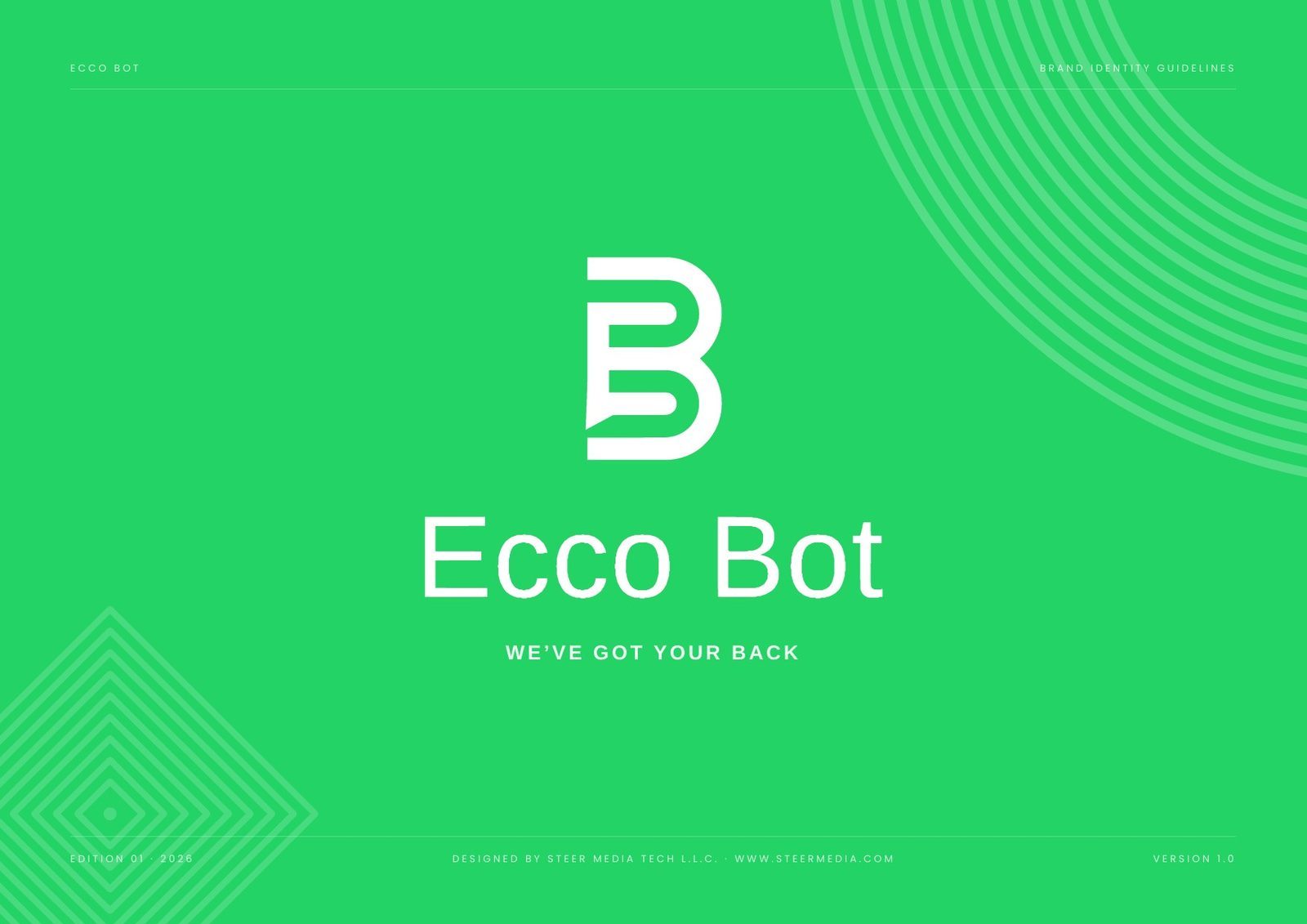
At a glance: the identity system, specified.
| Deliverable | Brand identity guidelines v1.0: 18 pages, seven sections |
| Mark | A horizontal lockup, plus a bubble-B monogram for icons and avatars |
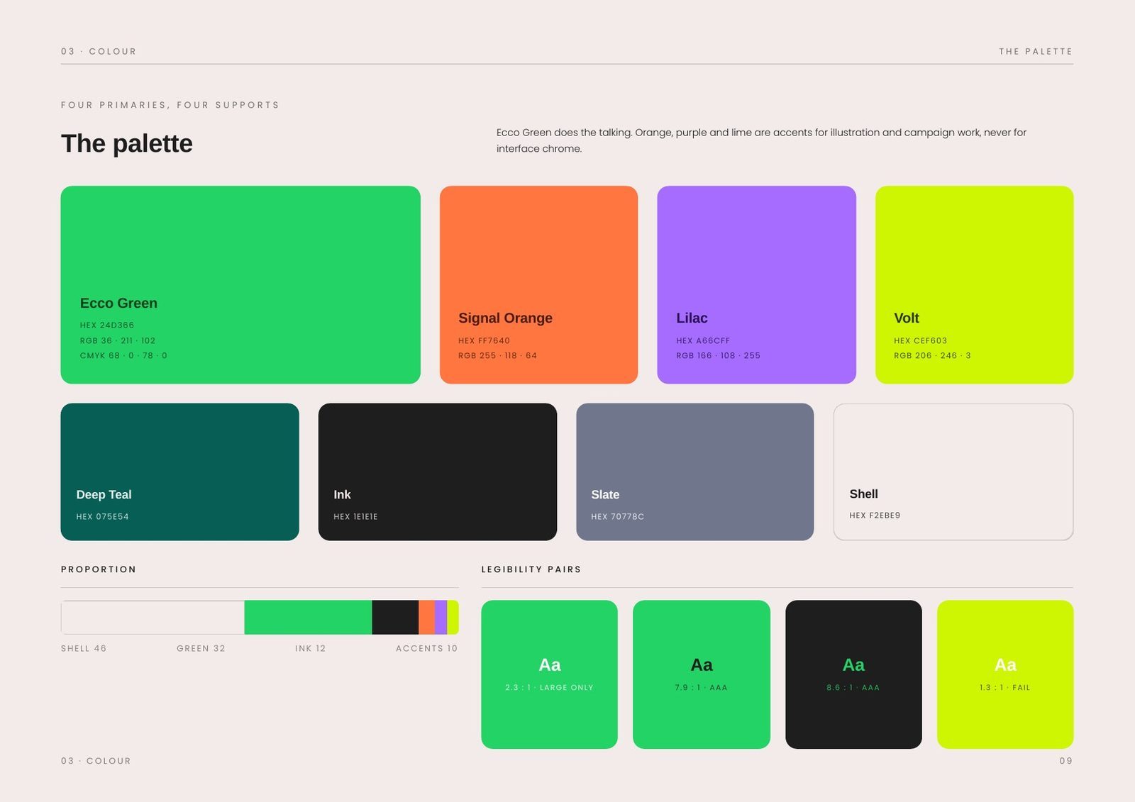
| Palette | 8 colours: four primaries and four supports, led by Ecco Green #24D366 |
| Proportion | Shell 46 · green 32 · ink 12 · accents 10 |
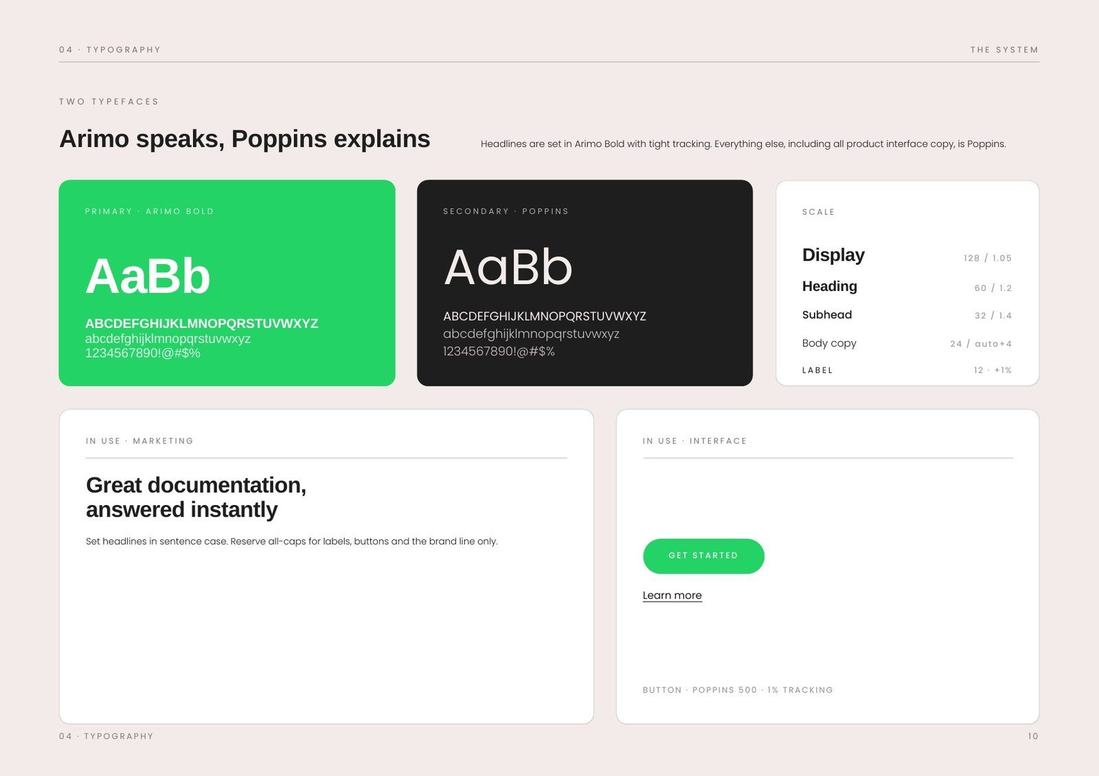
| Typography | Arimo for headlines and all interface copy; Poppins for documentation and body |
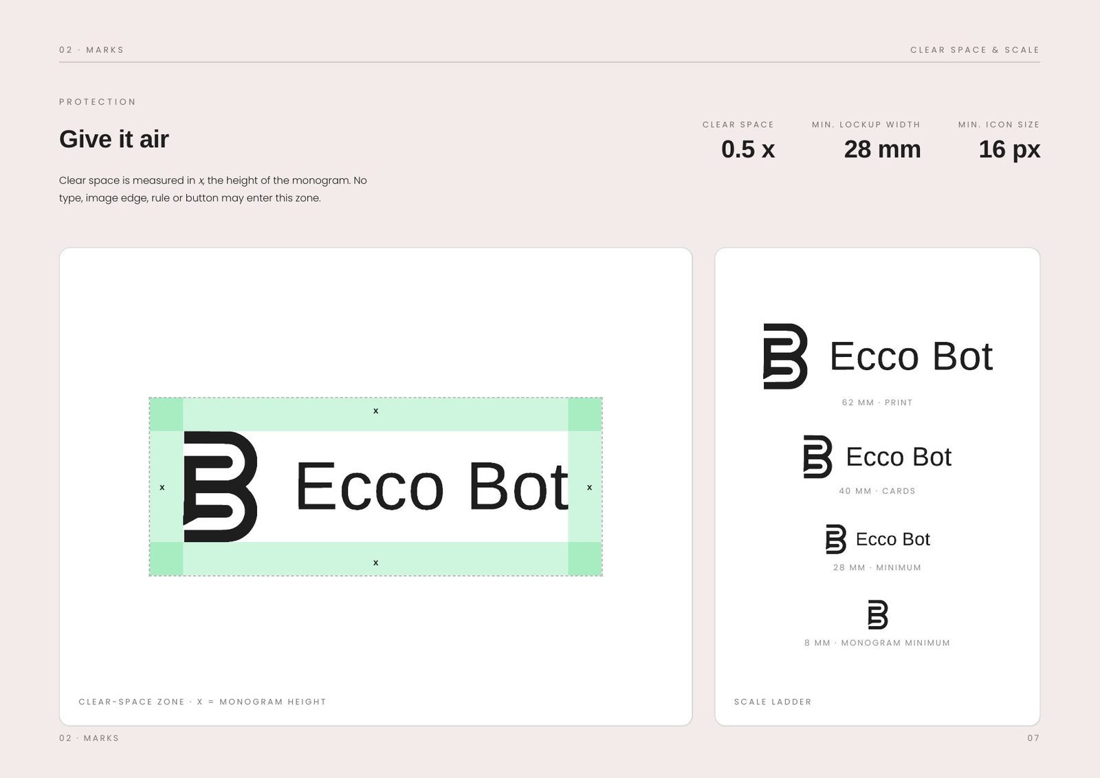
| Minimum size | 28 mm in print; 16 px on screen for the bubble alone; clear space of half the monogram height |
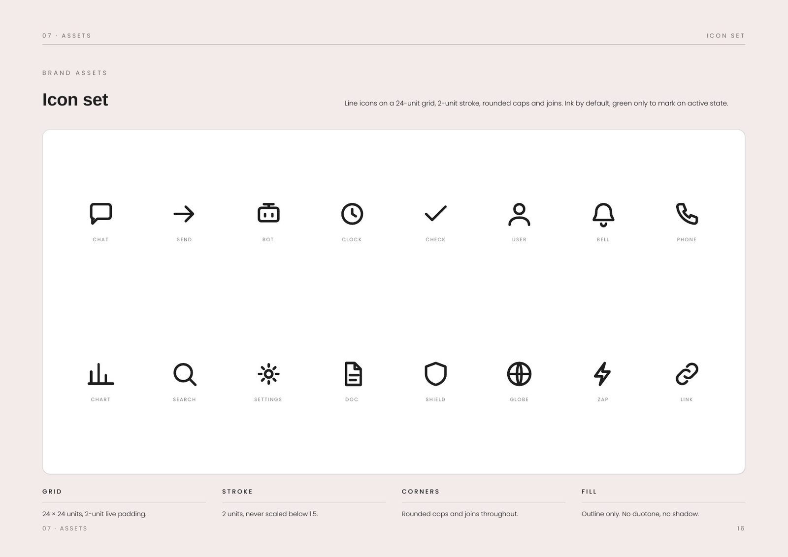
| Icon grid | 24 px with a two-unit stroke |
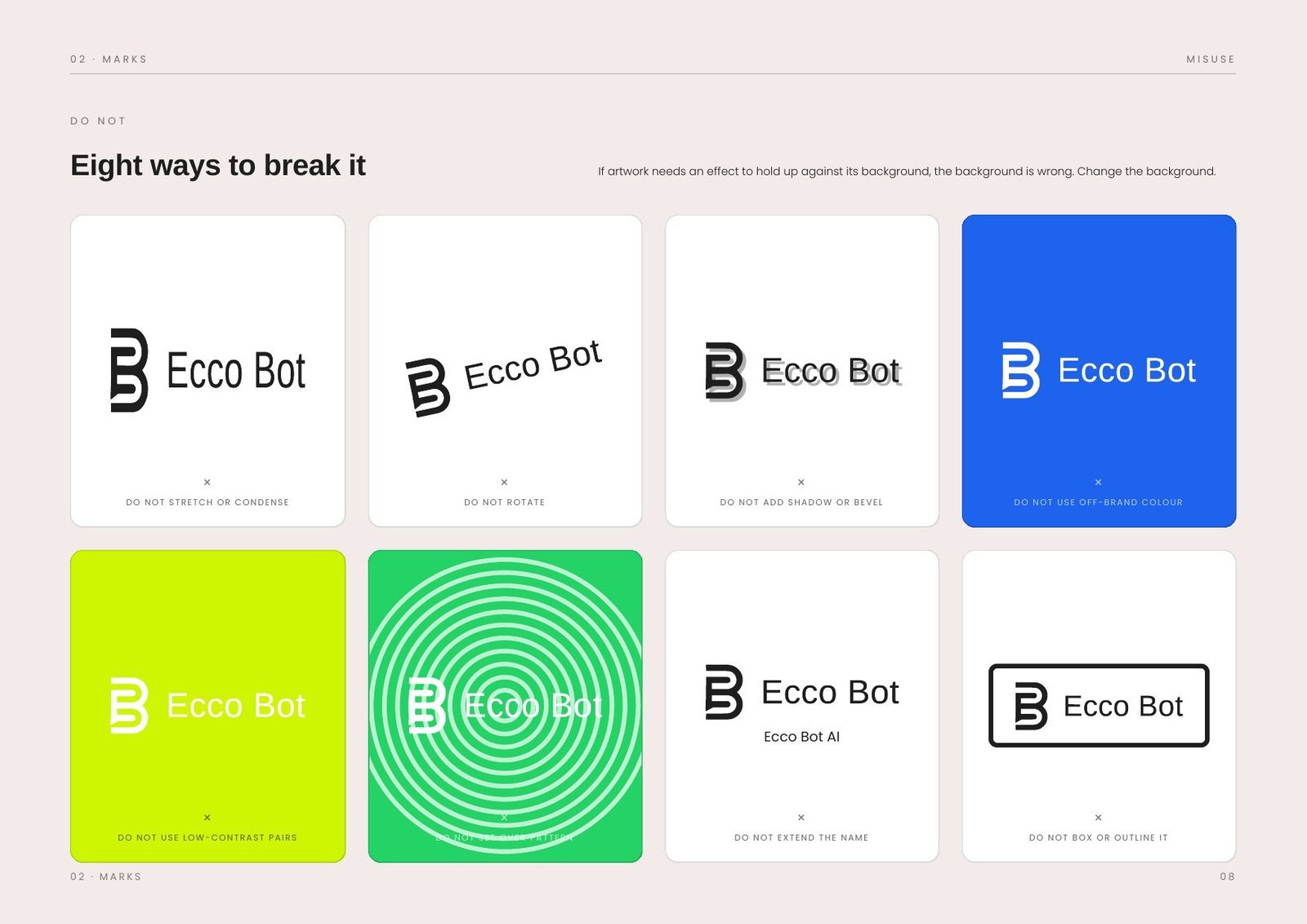
| Misuse rules | 8, each illustrated |
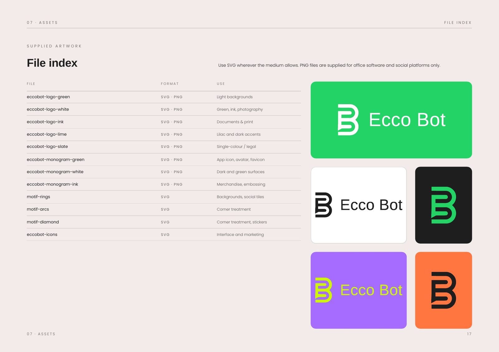
| Files | Logos as SVG and PNG, motifs as croppable tiles, with a file index for suppliers |
The challenge: automation that nobody wants to sound automated.
Messaging automation has a tone problem before it has a design problem. The category defaults to blue, to abstract nodes and circuits, and to interface copy that lectures. All of it says software at exactly the moment a customer wants to feel answered by a person.
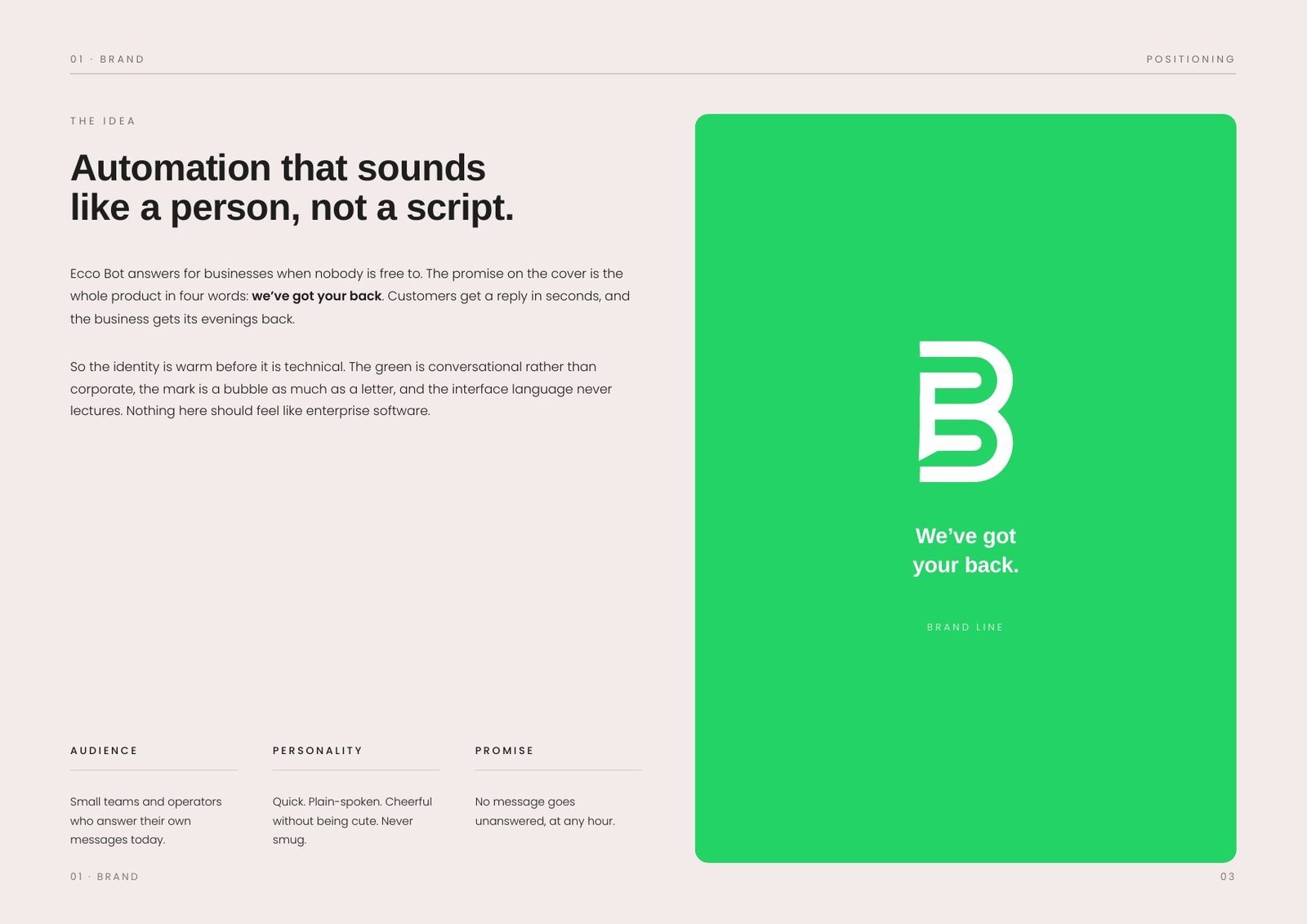
Ecco Bot answers for businesses when nobody is free to. The promise is four words long, we've got your back, and the identity had to carry it without undercutting it. Customers get a reply in seconds and the business gets its evenings back.
The idea: warm before it is technical.
The green is friendly, not corporate, and the mark is as much a speech bubble as a letter. The interface copy never lectures, and nothing in the system is allowed to feel like enterprise software.
That is a constraint on the whole kit, not a mood board: it decides the palette, the roundness of the monogram, the length of a button label and the difference between a photograph and an illustration.
Audience
Small teams and operators who answer their own messages today, the people still typing replies at eleven at night.
Personality
Quick, plain-spoken and cheerful without being cute. Never smug. It should sound like a capable colleague, not a mascot.
Promise
No message goes unanswered, at any hour. Every application in the book is measured against that sentence.
The mark: a speech bubble hiding inside a B.
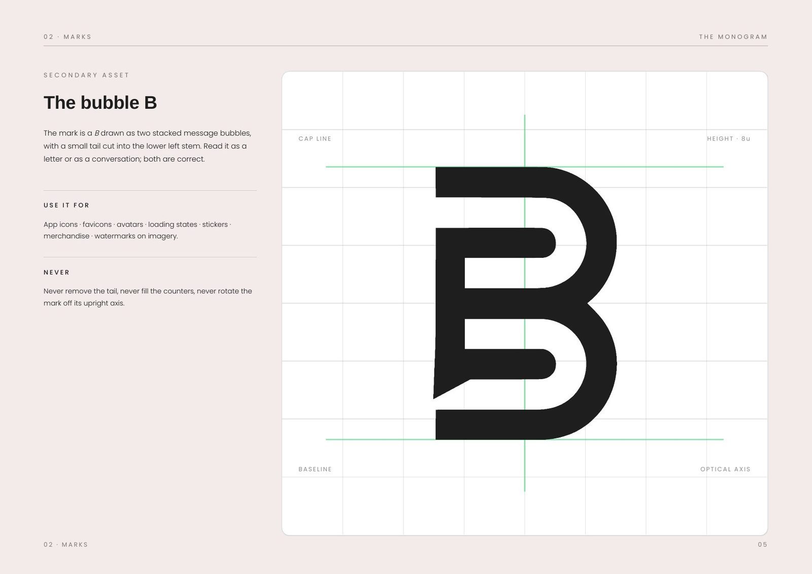
The monogram is drawn as two stacked message shapes, with a small tail cut into the lower-left stem. Read it one way and it is a B; read it the other and it is a conversation. It never rotates and never loses the tail, because that notch carries the whole idea.
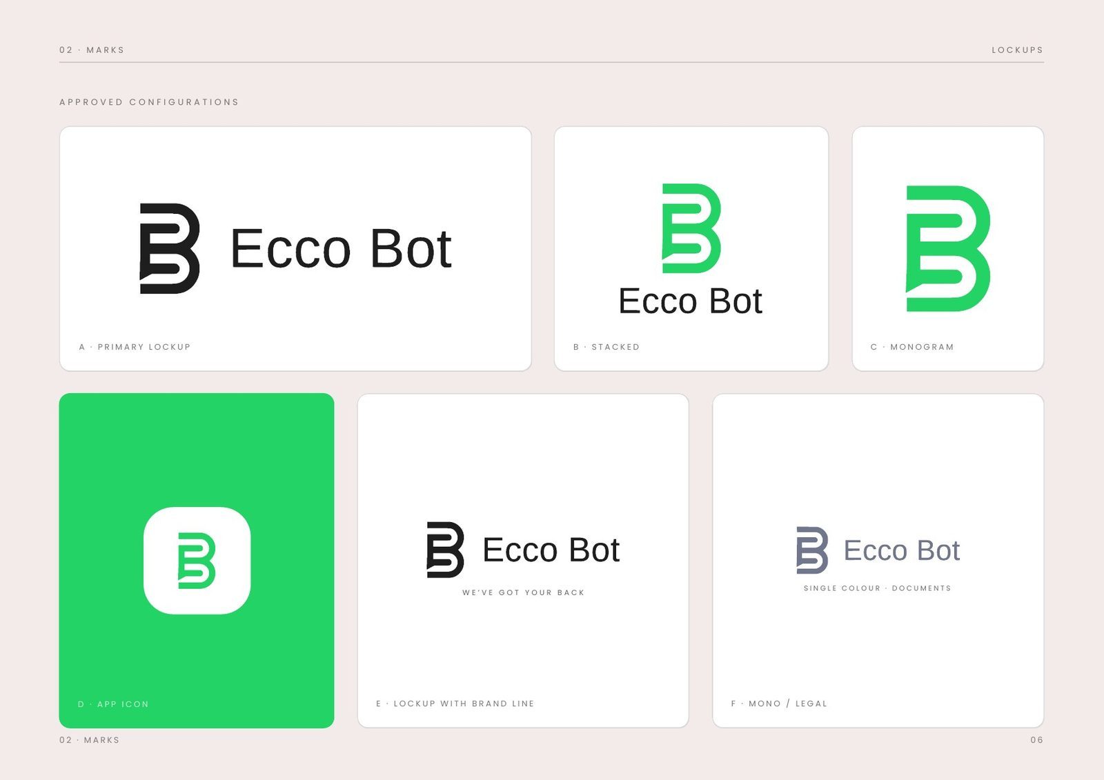
The bubble detaches from the horizontal lockup for app icons, favicons, avatars, loading states, stickers and merchandise, where the full name would collapse.
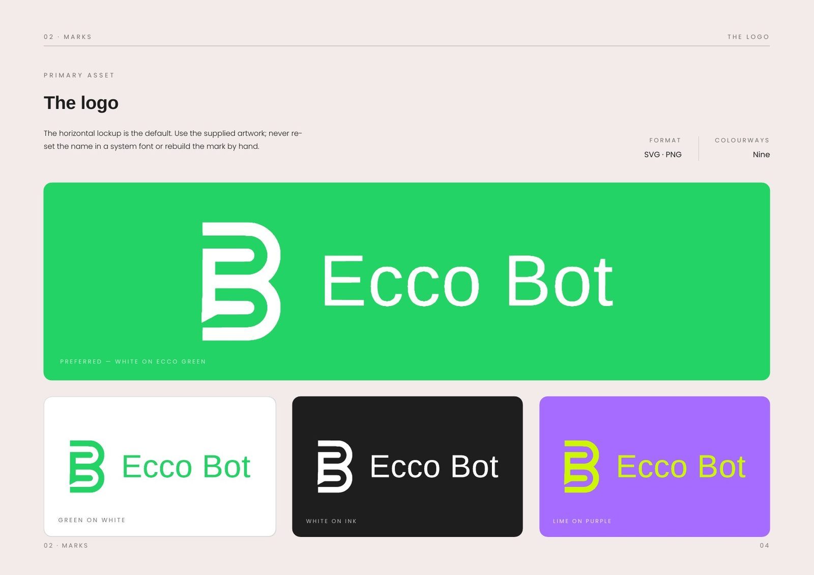
The logo
The horizontal lockup is the default. It is always placed from supplied artwork, never re-set in a system font or rebuilt by hand.
The bubble B
The secondary asset, for small sizes and square frames. Approved on green, on white, on ink and in single colour.
Clear space & scale
Clear space of half the monogram height on every side. Minimum 28 mm in print, 16 px on screen for the bubble alone.
Eight ways to break it
Stretching, re-colouring, outlining, shadowing, re-typing the name, dropping it on a busy background, adding a strapline, boxing it in.
Colour: four primaries, four supports.
Ecco Green does the talking. Orange, purple and lime are accents for illustration and campaign work and never for interface chrome. That rule keeps the product calm while the marketing stays loud.
The proportion is kept tight: shell 46, green 32, ink 12, accents 10. Contrast pairs are documented, including the one that fails (green type on green), so it never ships by accident.
The system: Arimo speaks, Poppins explains.
Two typefaces, split by job. Headlines are set in Arimo with tight tracking, and so is all product interface copy, so the app sounds like the brand. Poppins carries documentation, marketing body and anything that has to explain itself.
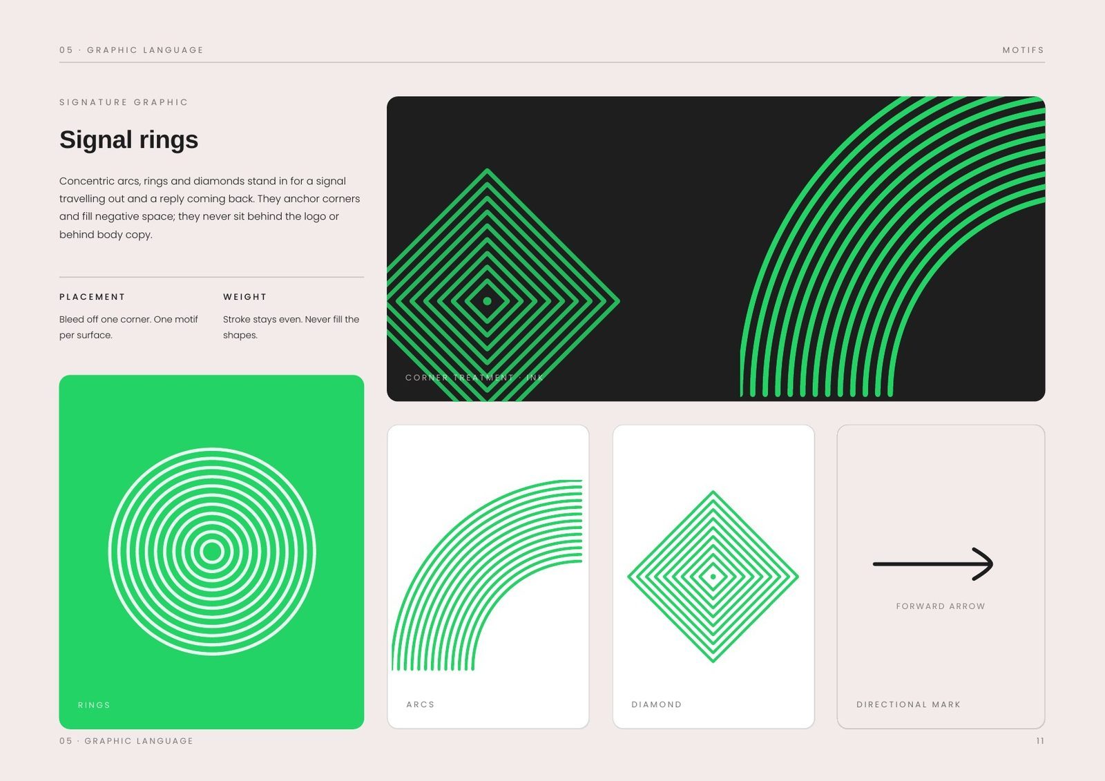
The graphic language is built from signal rings: concentric arcs, rings and diamonds drawn as a message travelling outward. They sit at corners and edges, always cropped and never floating in the middle of a layout, so they frame the content instead of decorating it.
Real people first, then playful proof.
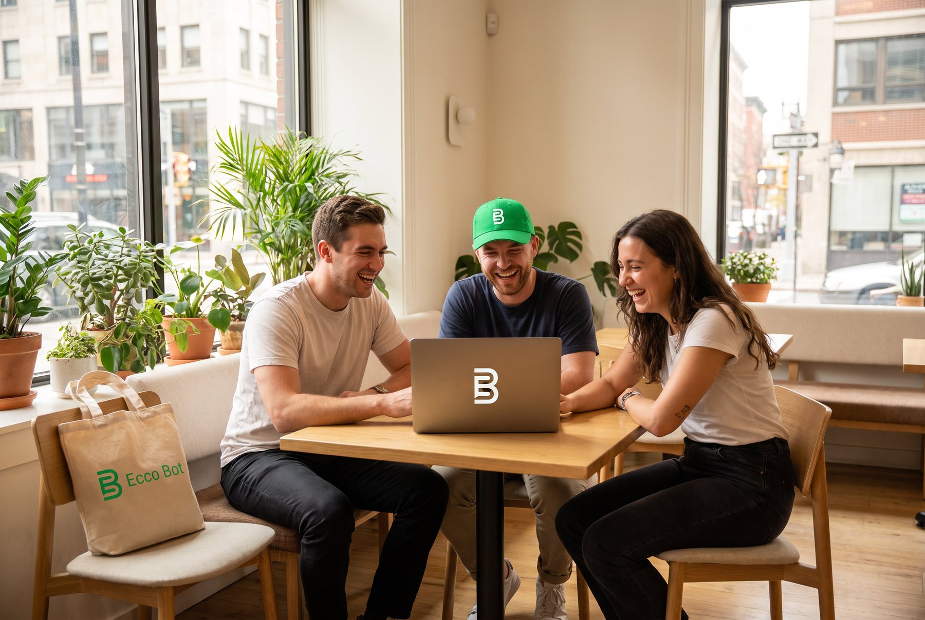
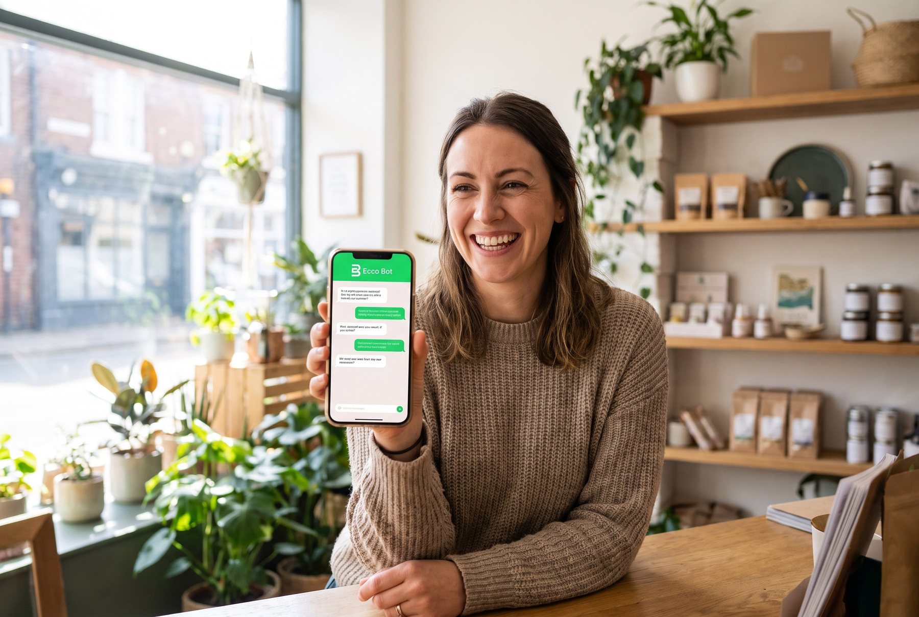
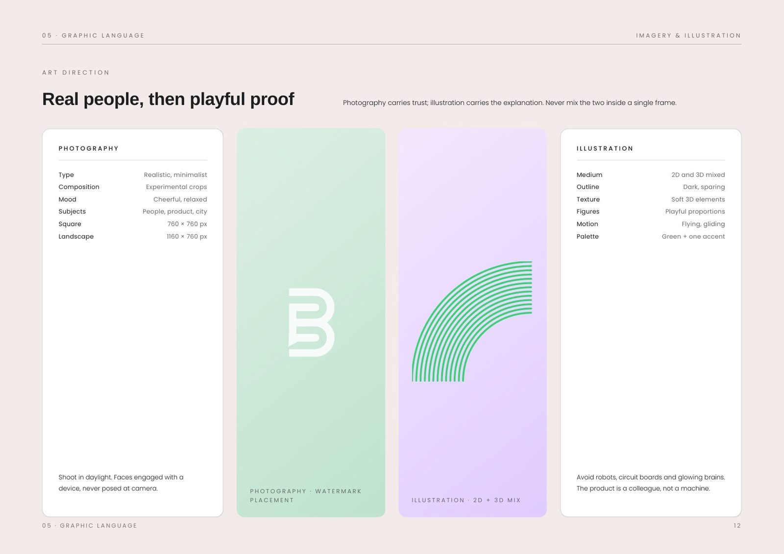
Photography carries the trust and illustration carries the explanation, never the other way round and never both in one frame. Photos are shot in daylight, with faces engaged with the device and screens never bright enough to become the subject.
Applications: the product is the brand's loudest surface.
For a messaging product the interface is the identity, seen thousands of times a day. Outgoing messages sit in green, incoming in white, and the bot always identifies itself in its first reply: it never pretends to be a human.
Beyond the app, the system covers web and social, merchandise and print. Each post uses one motif, the avatar is always the monogram on green, and embroidery uses the bubble alone so no detail is lost in the stitching.
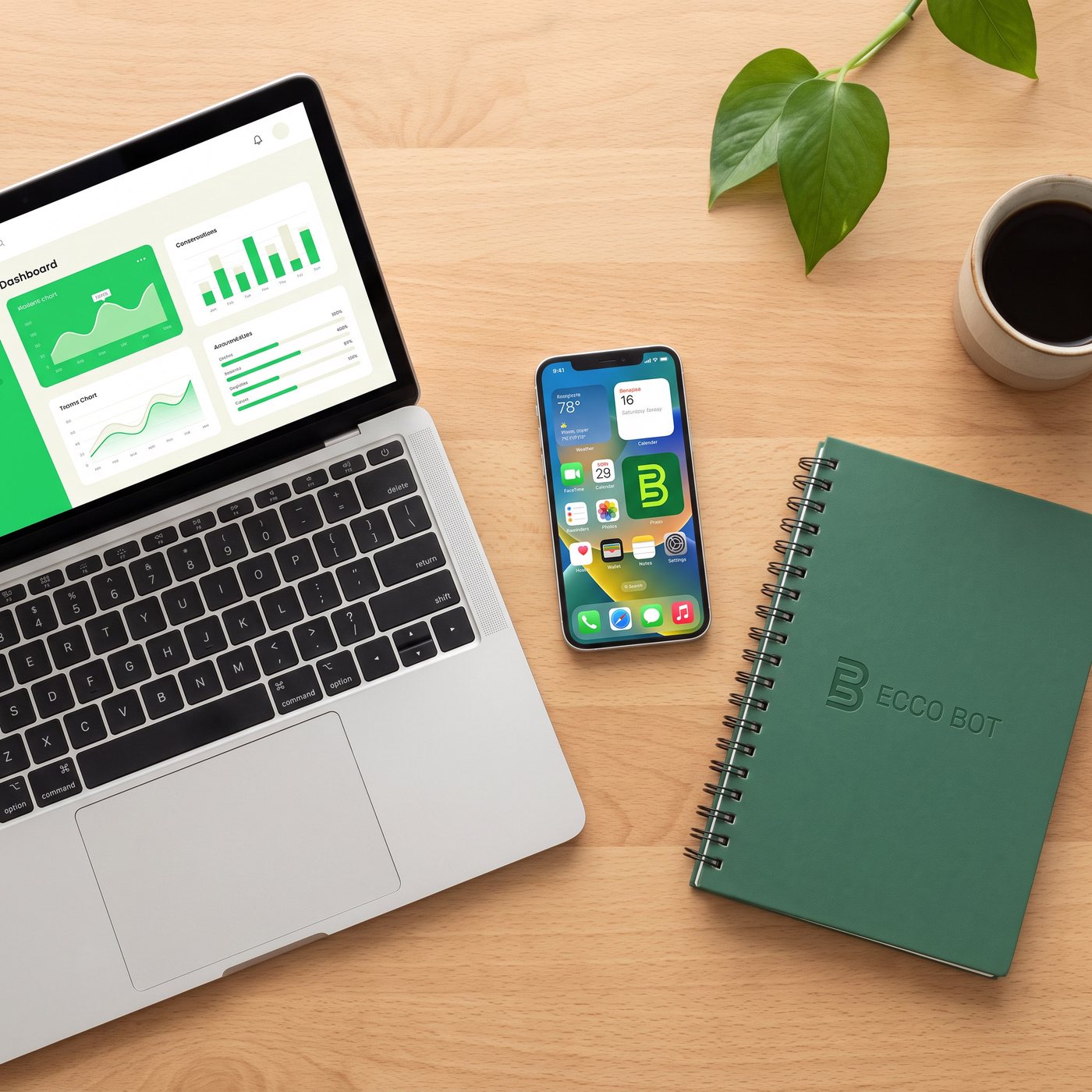
The same voice on the dashboard, the phone and the notebook.
The point of the system is that nothing changes register between surfaces. Green stays conversational at desk scale, the monogram holds at icon scale, and the printed pieces use the same two typefaces doing the same two jobs.
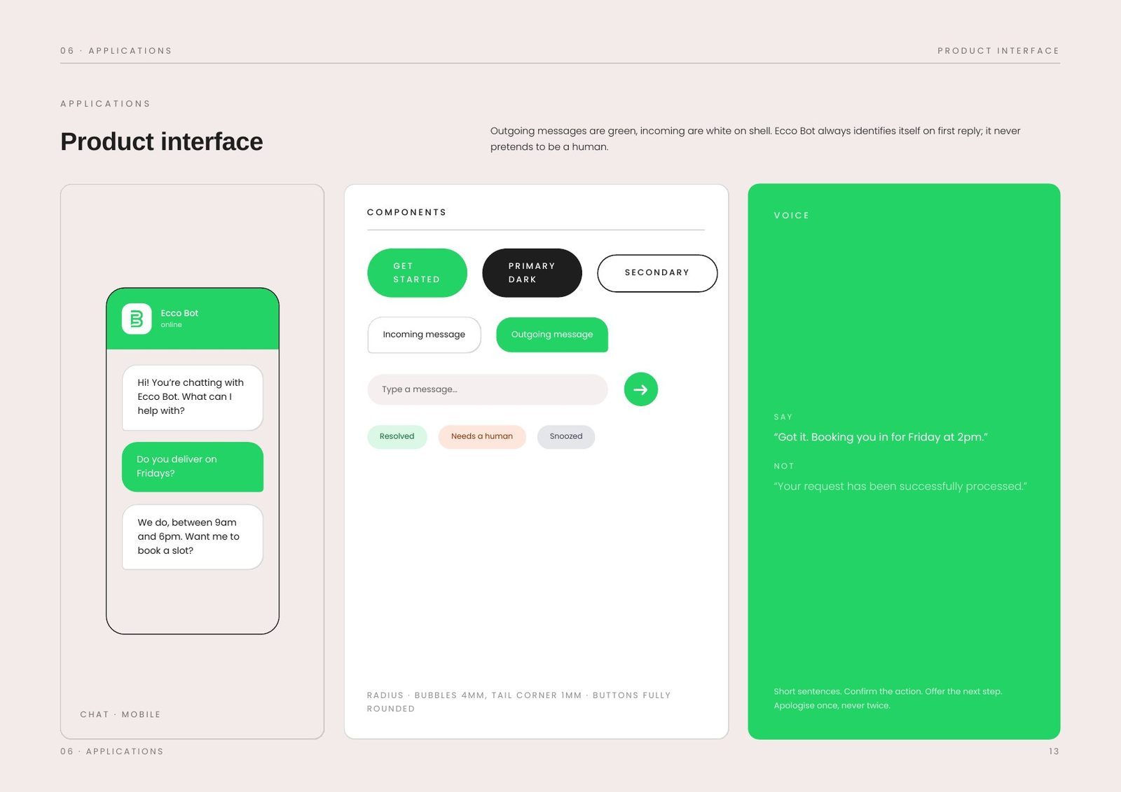
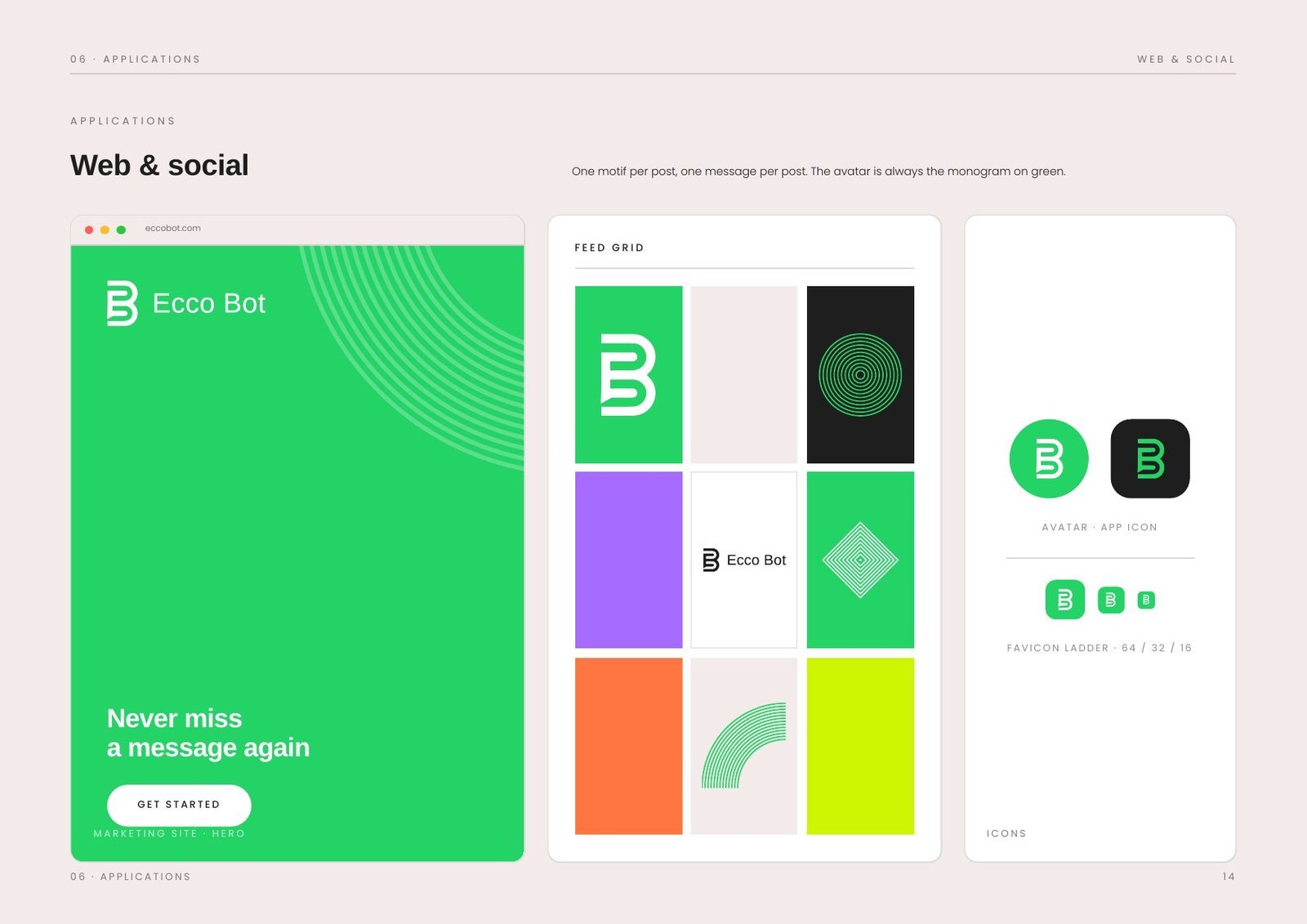
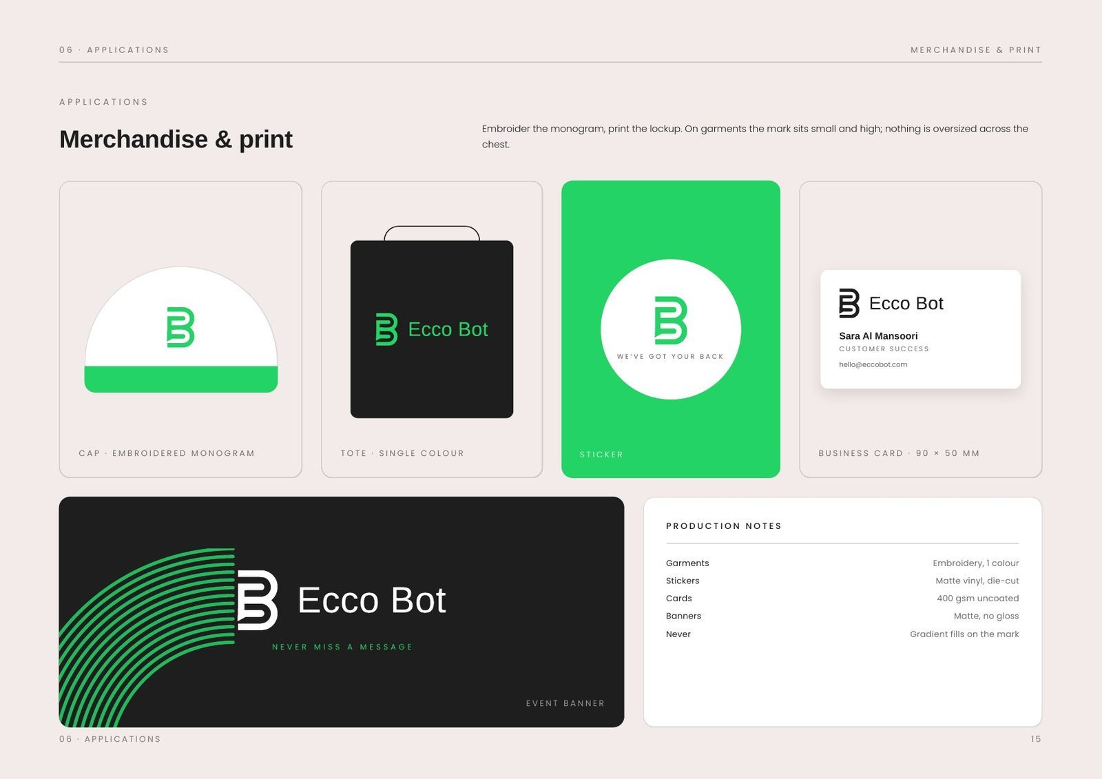
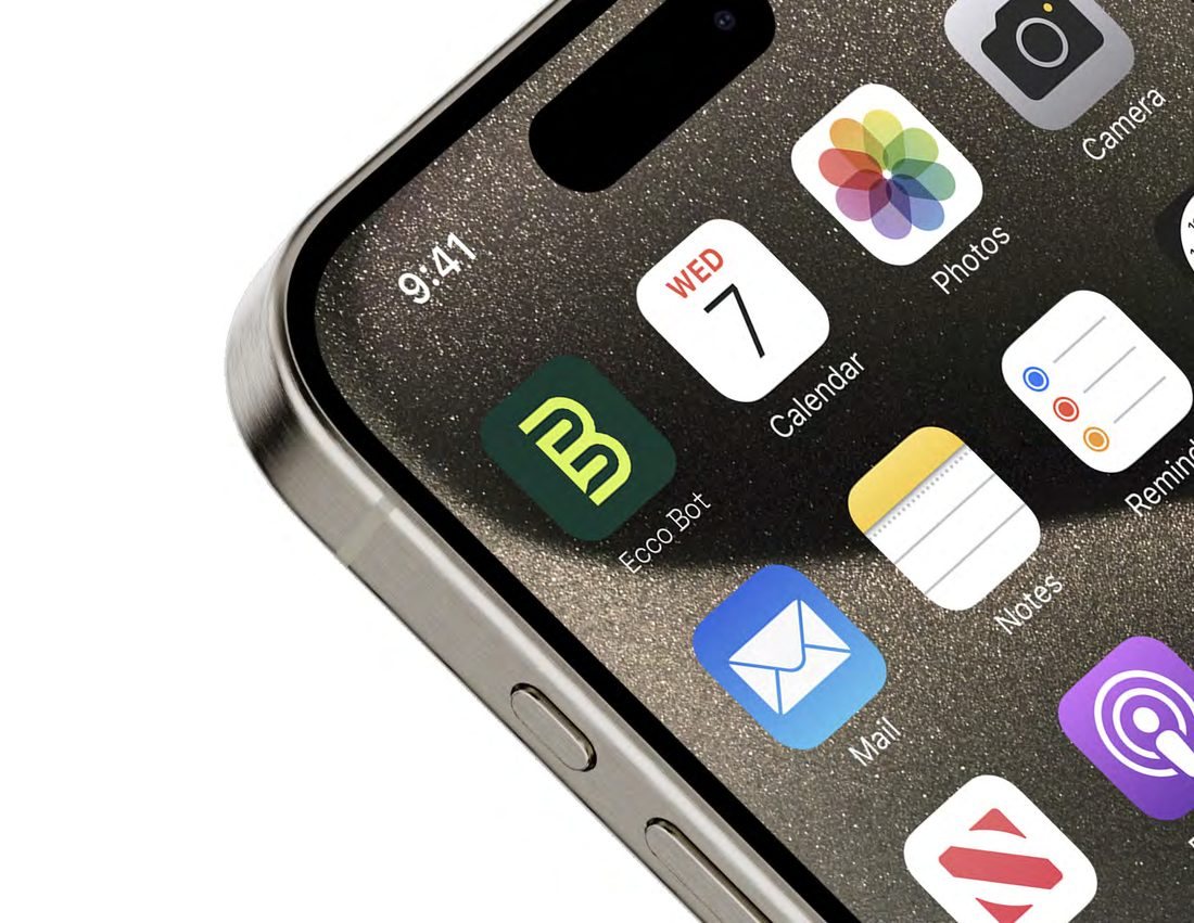
Pages across seven sections: brand, marks, colour, typography, graphic language, applications and assets.
Colours in a fixed proportion: four primaries and four supports, with accents kept out of the interface chrome.
Icon grid with a two-unit stroke, so a set drawn later still matches the set drawn here.
The book closes with a file index that lists every supplied artwork by filename, format and use. Logos ship as SVG and PNG, motifs as croppable tiles, and each entry states where it may and may not be used, so the right file reaches the right supplier without a phone call.
Nothing here should feel like enterprise software.
Have a project like this?
Tell us what you are building. We reply to every enquiry within one working day.