PulseFit: Scrubs, Uniforms & Workwear
An identity for a medical workwear brand built on a single refusal: we are not selling uniforms, we are selling an experience.
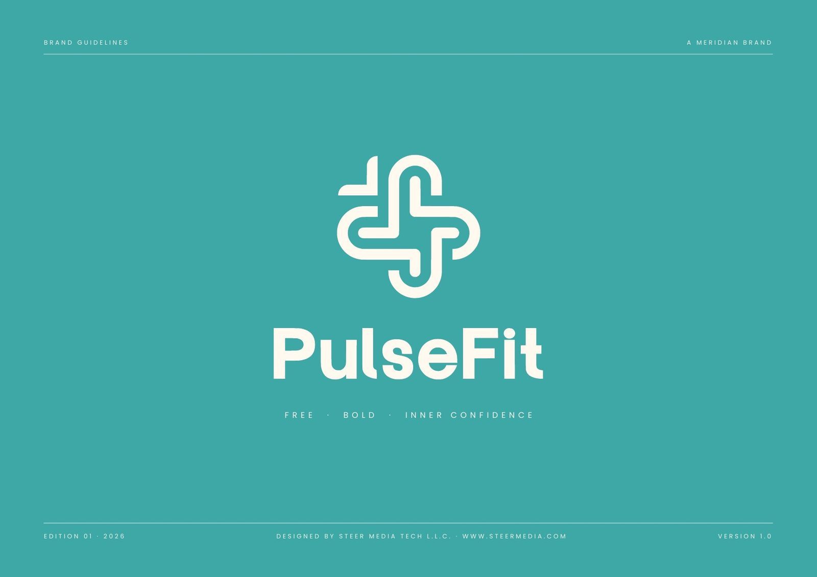
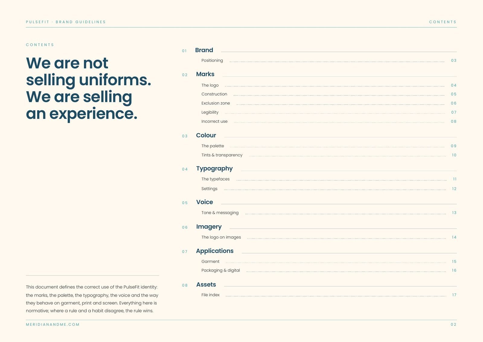
At a glance: the identity system, specified.
| Deliverable | Brand identity guidelines v1.0: 18 pages, eight sections |
| Lockups | 4 approved: corporate, product primary, product secondary, and the symbol alone |
| Construction | 6 × 6 grid; corporate lockup 72.1 mm; symbol minimum 46 mm |
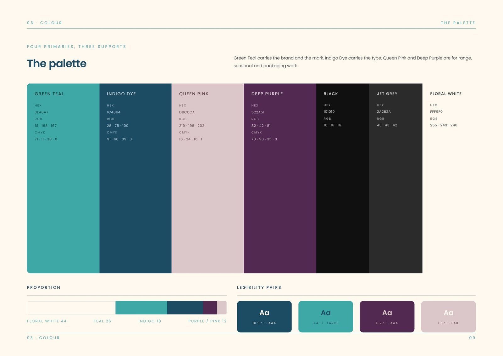
| Palette | 7 colours: four primaries and three supports, led by Green Teal #3EA8A7 and Indigo Dye #1C4B64 |
| Proportion | Floral white 44 · teal 26 · indigo 18 · purple and pink 12 |
| Typography | 3 typefaces: Clover Display, Patriona and Arial |
| Embroidery | Chest 38 mm, sleeve 30 mm, hip or pocket 26 mm; single-colour thread only |
| Misuse rules | 10, each illustrated |
| Files | SVG for anything that scales, PNG for office software and social platforms |
The challenge: a category people are told to wear.
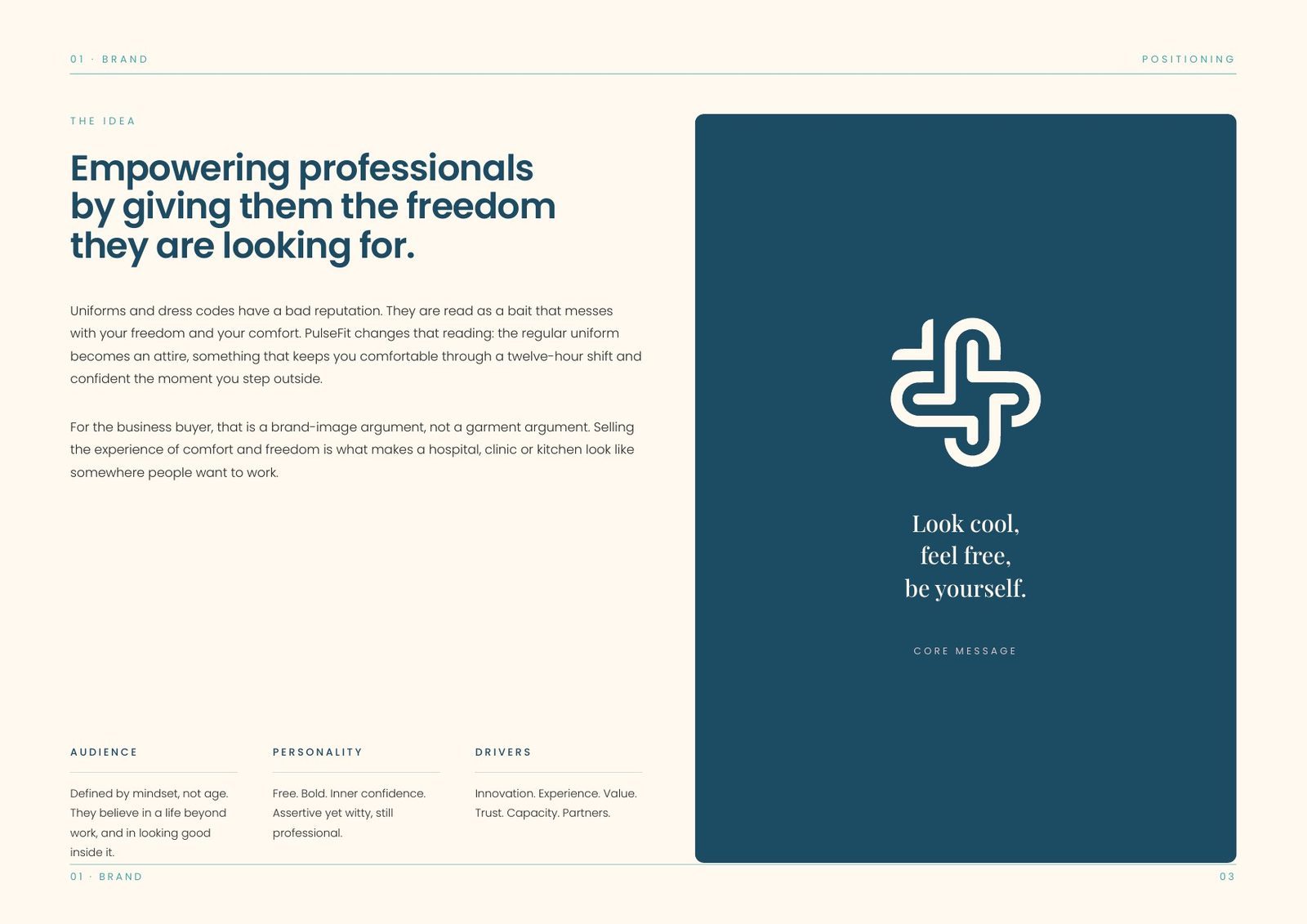
Uniforms and dress codes carry a bad reputation. People see them as something imposed, a limit on freedom and comfort chosen by somebody else and worn because you have to.
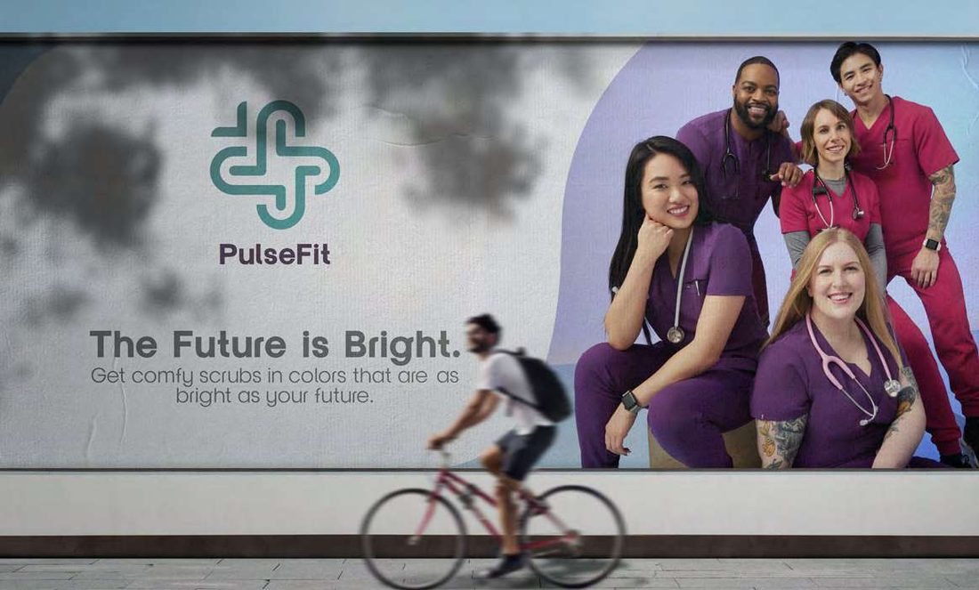
PulseFit turns the regular uniform into attire, something that keeps you comfortable through a twelve-hour shift and confident the moment you step outside. Every decision in the identity had to support that idea.
The idea: a brand-image argument, not a garment argument.
The buyer is rarely the wearer. For a hospital, clinic or kitchen the pitch is not fabric weight. It is that selling the experience of comfort and freedom is what makes a workplace look like somewhere people want to work.
So the identity sells the feeling before the product, and the core message says it in six words: look cool, feel free, be yourself.
Audience
Defined by mindset, not age: people who believe in a life beyond work, and in looking good while they live it.
Personality
Free, bold and self-assured. Assertive yet witty, and still professional enough for a clinical setting.
Drivers
Innovation, experience, value, trust, capacity and partners. These are the six things buyers judge the brand on.
The mark: one ribbon, four folds.
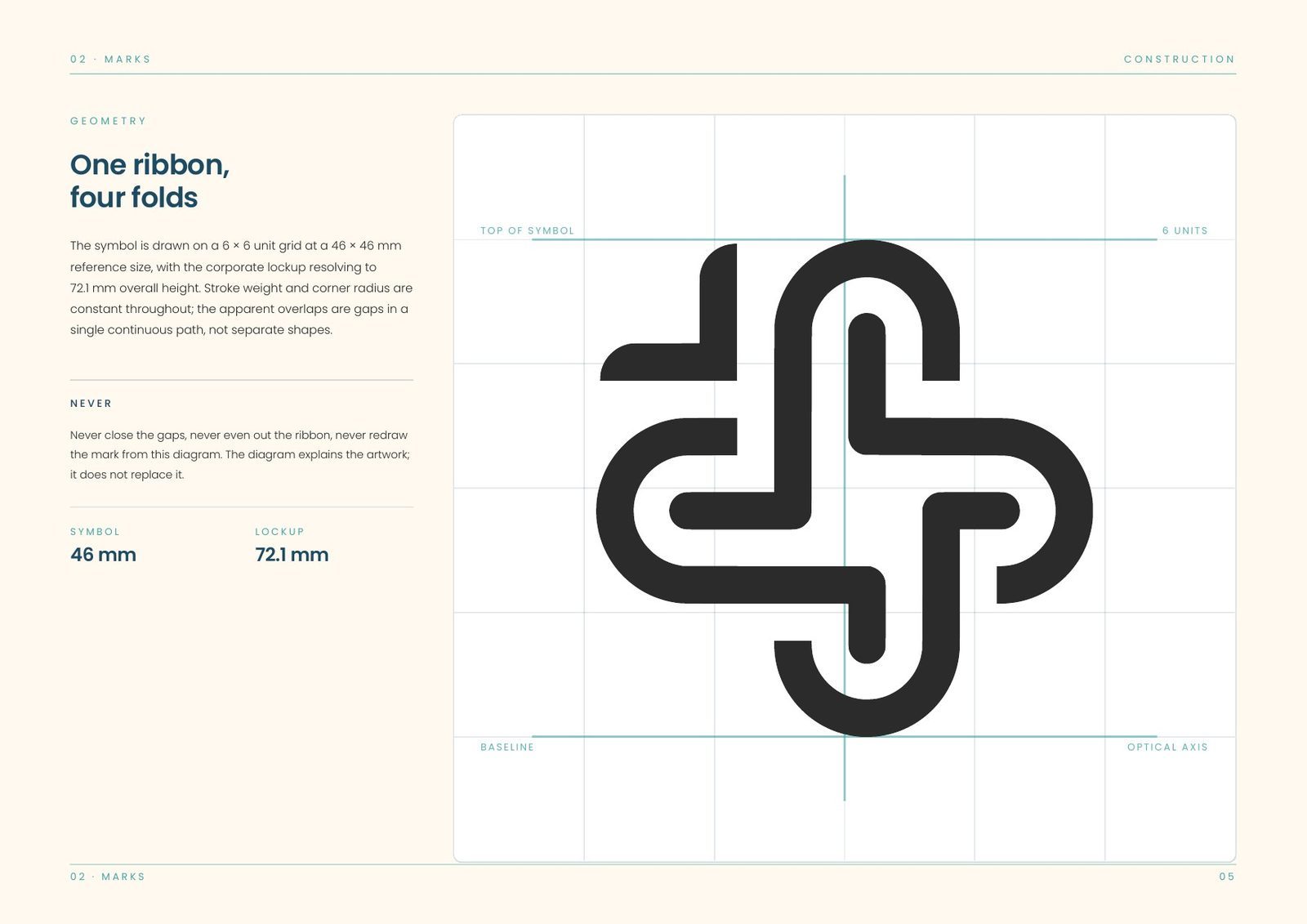
The symbol is a continuous ribbon folded into a cross, a pulse line and a care mark in one stroke. It is drawn as a single continuous path with even weight and corner radius throughout, and the apparent overlaps are gaps in that path rather than separate shapes.
Because the ribbon is one line, it cannot be rebuilt by hand: the gaps are the construction. It is always placed from supplied artwork, and it never closes up.
Four approved forms
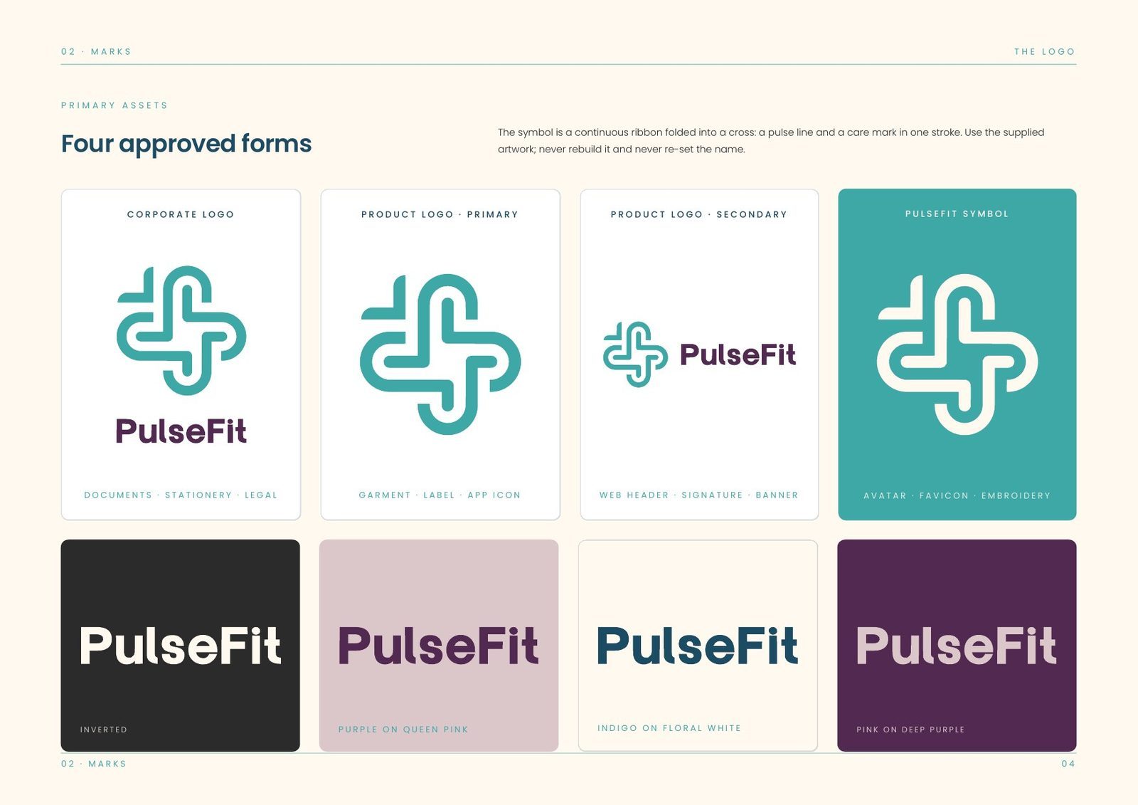
Corporate logo for documents and legal, product logo primary for garment and app icon, secondary for web headers and signature, and the symbol alone for badge, patch and embroidery.
Construction
Built on a 6 × 6 grid with the corporate lockup resolving to 72.1 mm overall height. Symbol minimum 46 mm, lockup 72.1 mm.
Exclusion & legibility
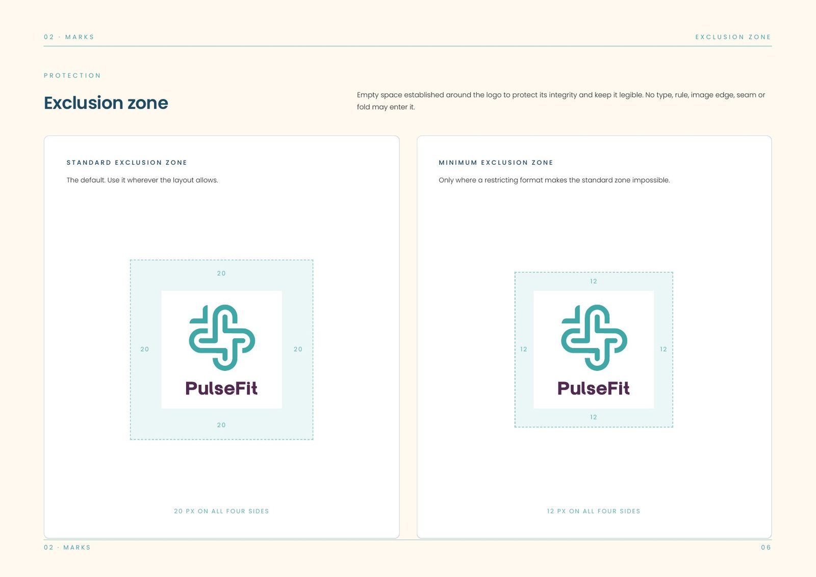
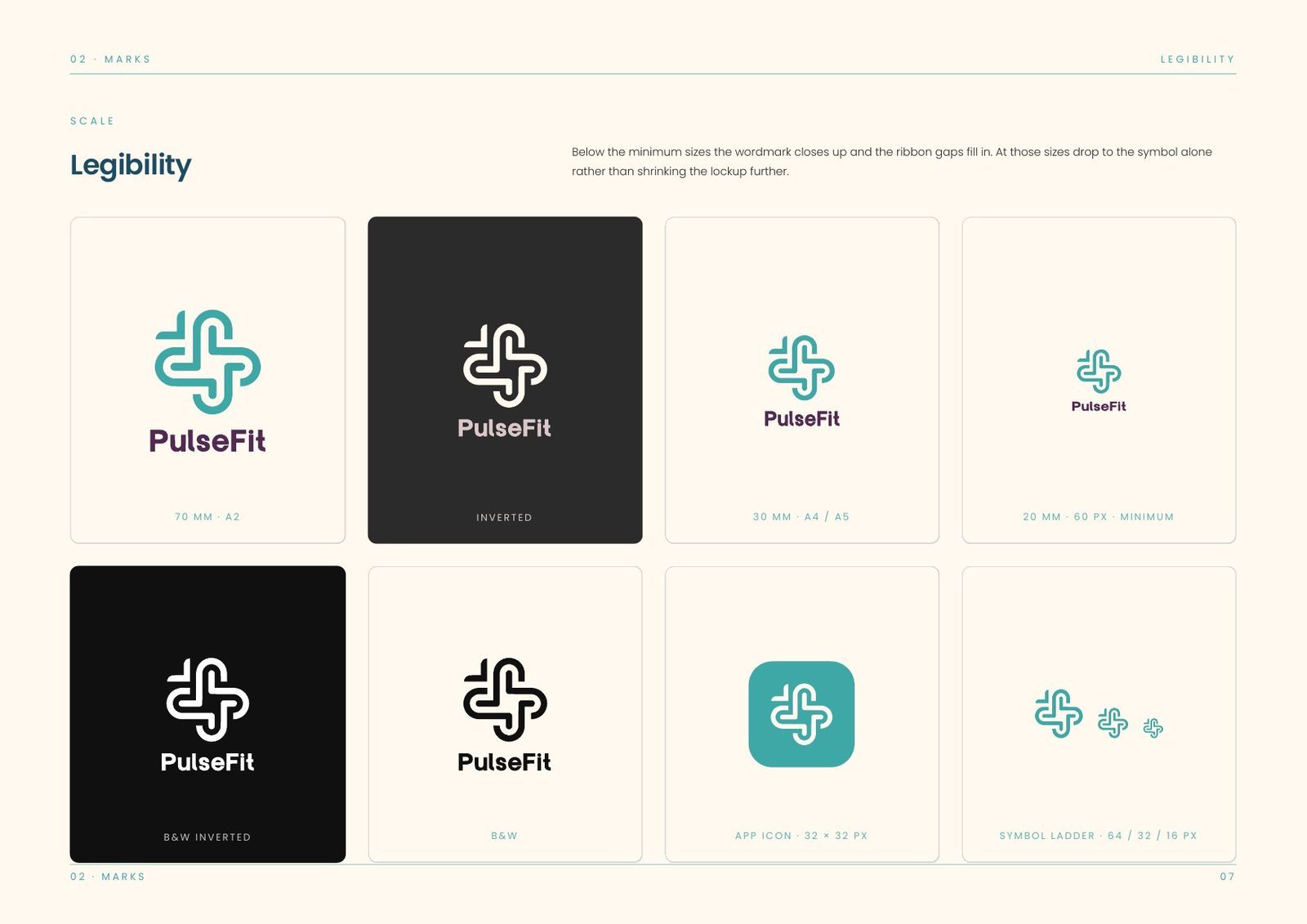
A clear zone around the logo keeps it legible. Below the minimum size the wordmark closes up and the ribbon gaps fill in, so the symbol is used alone instead of shrinking further.
Ten ways to break it
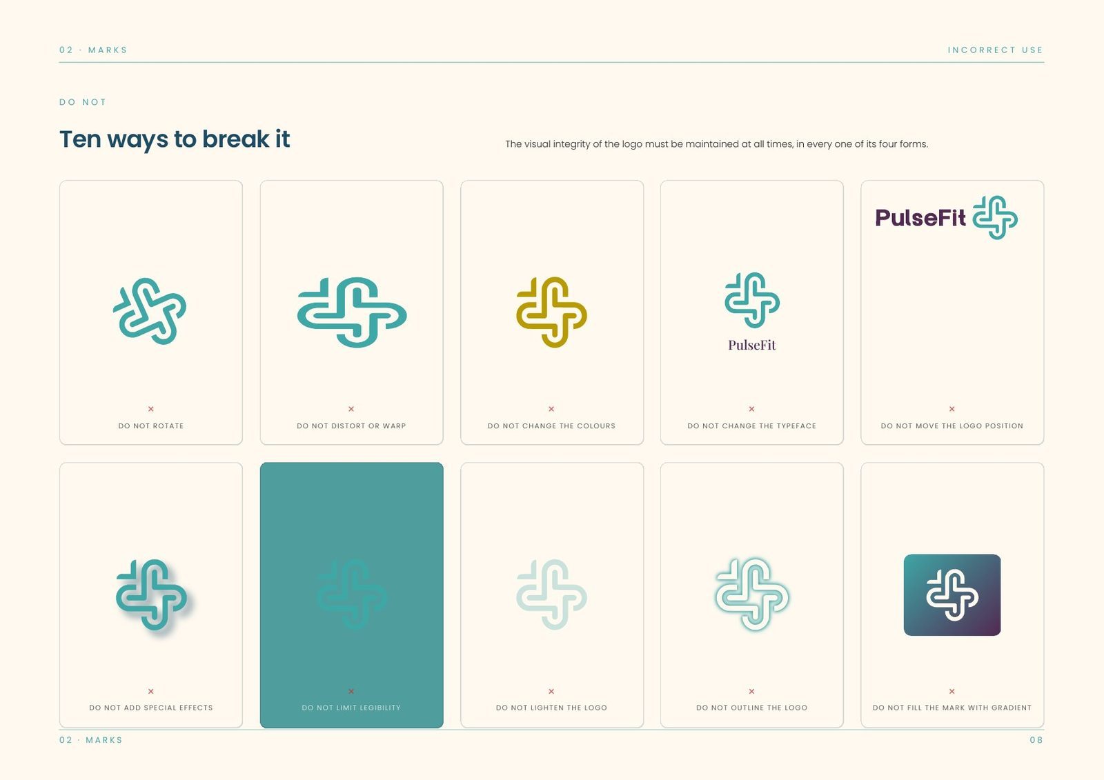
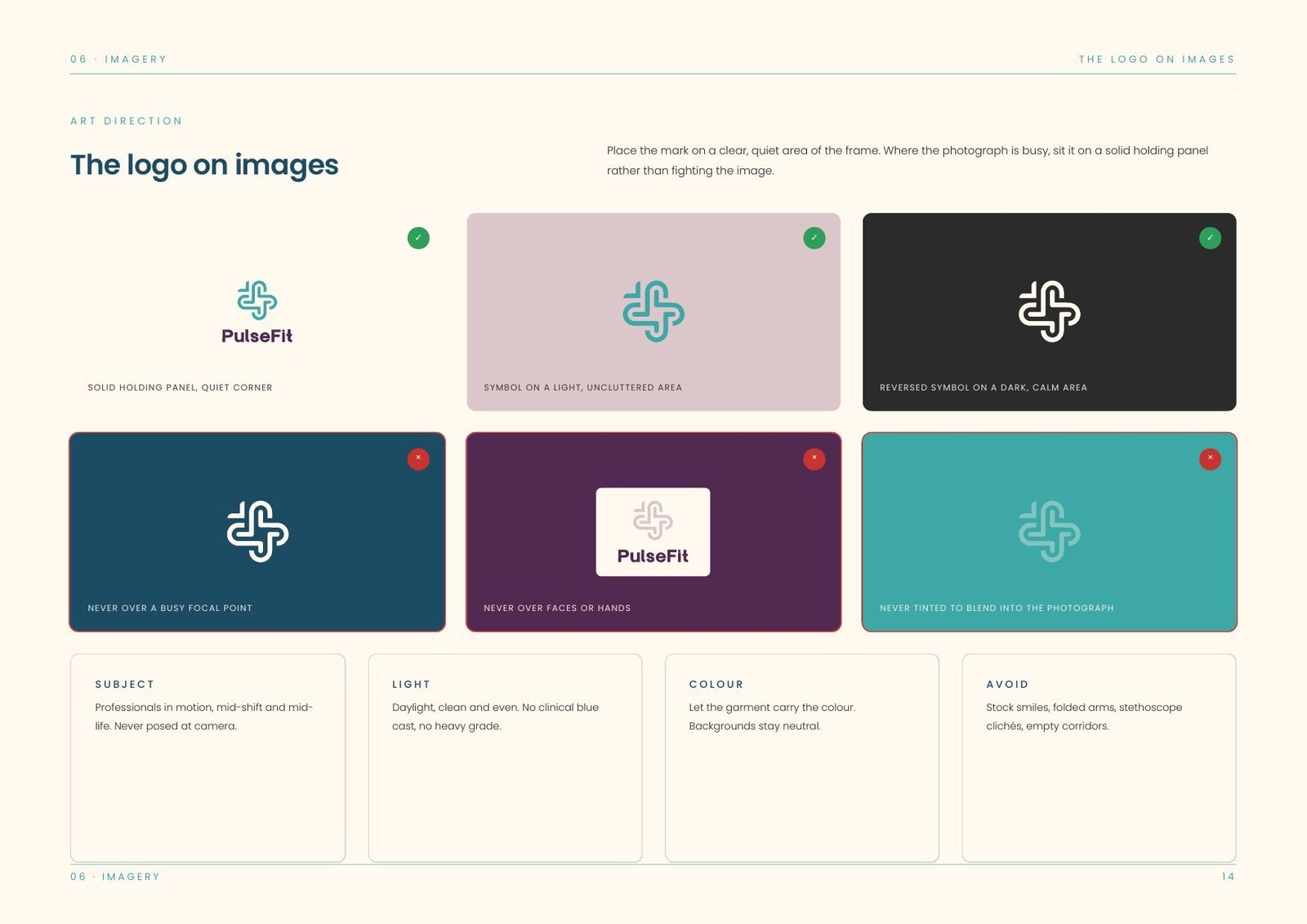
Rotating, re-weighting, re-colouring, adding effects, changing the lockup, filling the gaps, boxing it, outlining it, shadowing it, stretching it.
Colour: four primaries, three supports.
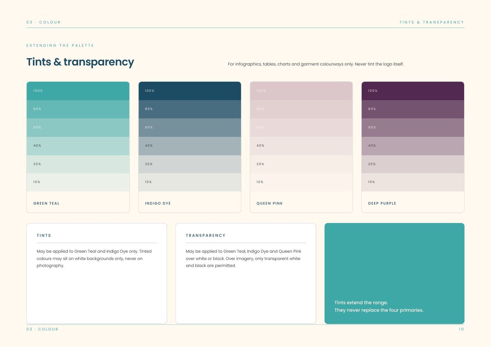
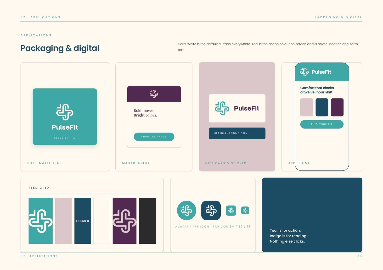
Green Teal carries the brand and the mark. Indigo Dye carries the type. Queen Pink and Deep Purple are for range, seasonal and packaging work. They make a shift feel less clinical without making it look unprofessional.
Proportion runs floral white 44, teal 26, indigo 18, purple and pink 12. Tints extend the palette for infographics, tables and garment colourways only, and are never allowed on the logo itself.
The system: three faces and a tone of voice.
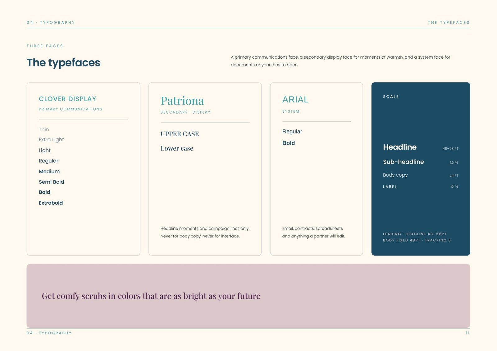
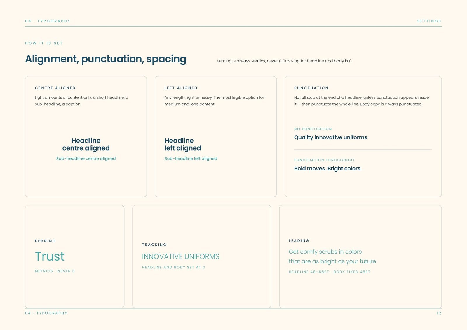
Three typefaces, split by job. Clover Display carries primary communications, Patriona is a secondary display face reserved for moments of warmth, and Arial is the system face for documents anyone has to open. Kerning is always optical, never metric.
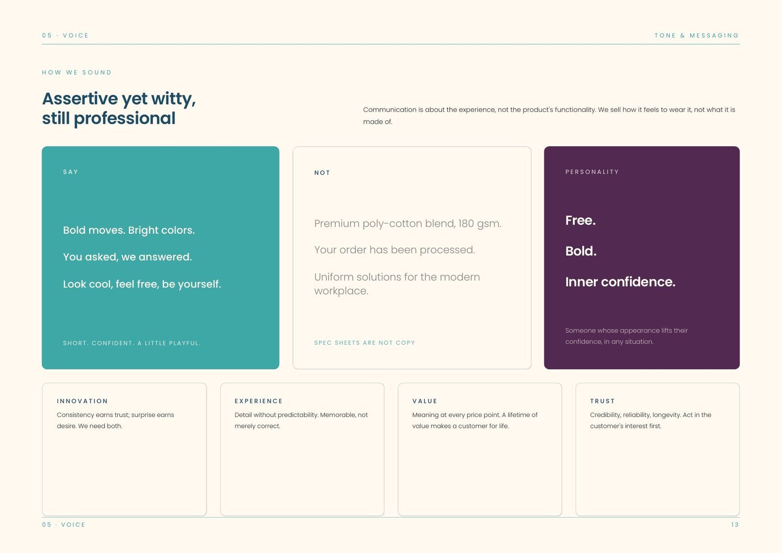
Unusually for a workwear brand, the book also sets out how the brand speaks: assertive yet witty, and still professional. The copy talks about the experience instead of the product's features, so it says you asked, we answered instead of premium poly-cotton blend, 180 gsm.
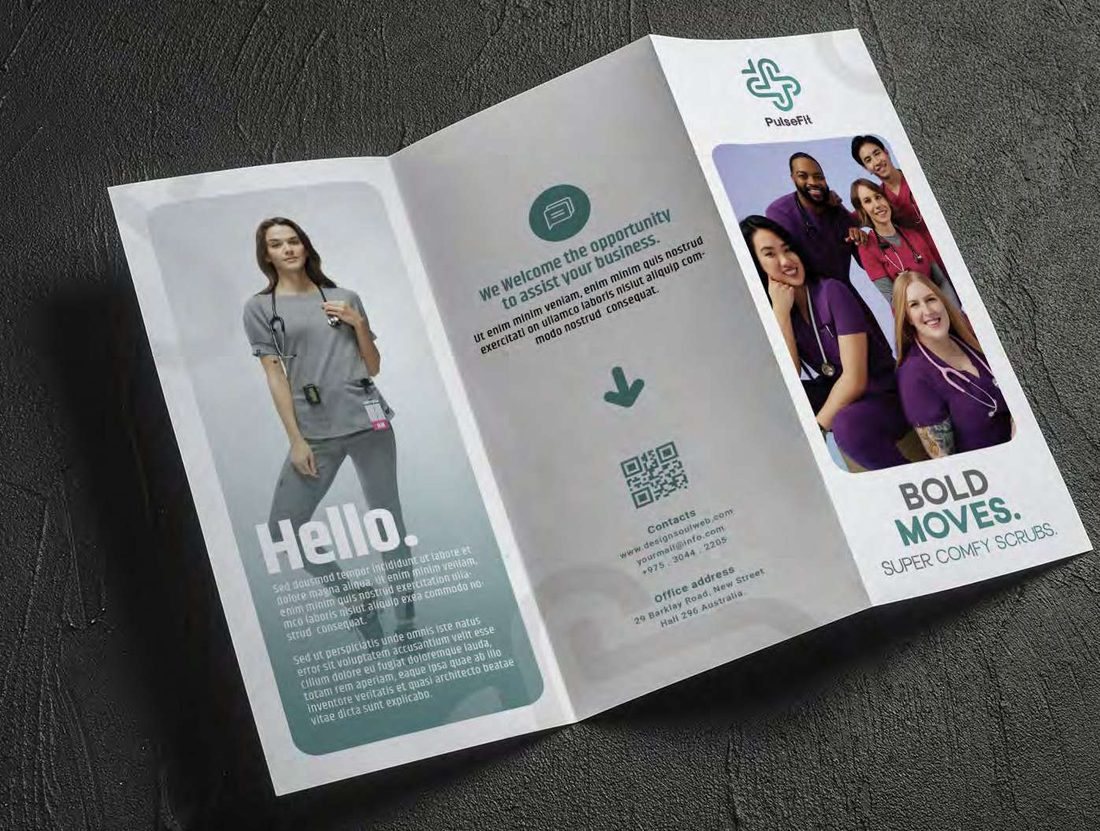
Bold moves. Super comfy scrubs.
The voice does the selling on every printed surface. It is short, direct and a little wry, with the specification kept where it belongs. Photography leads with people at work, so the garment is shown being worn instead of on display.
Applications: the garment is the first impression, the label is the second.
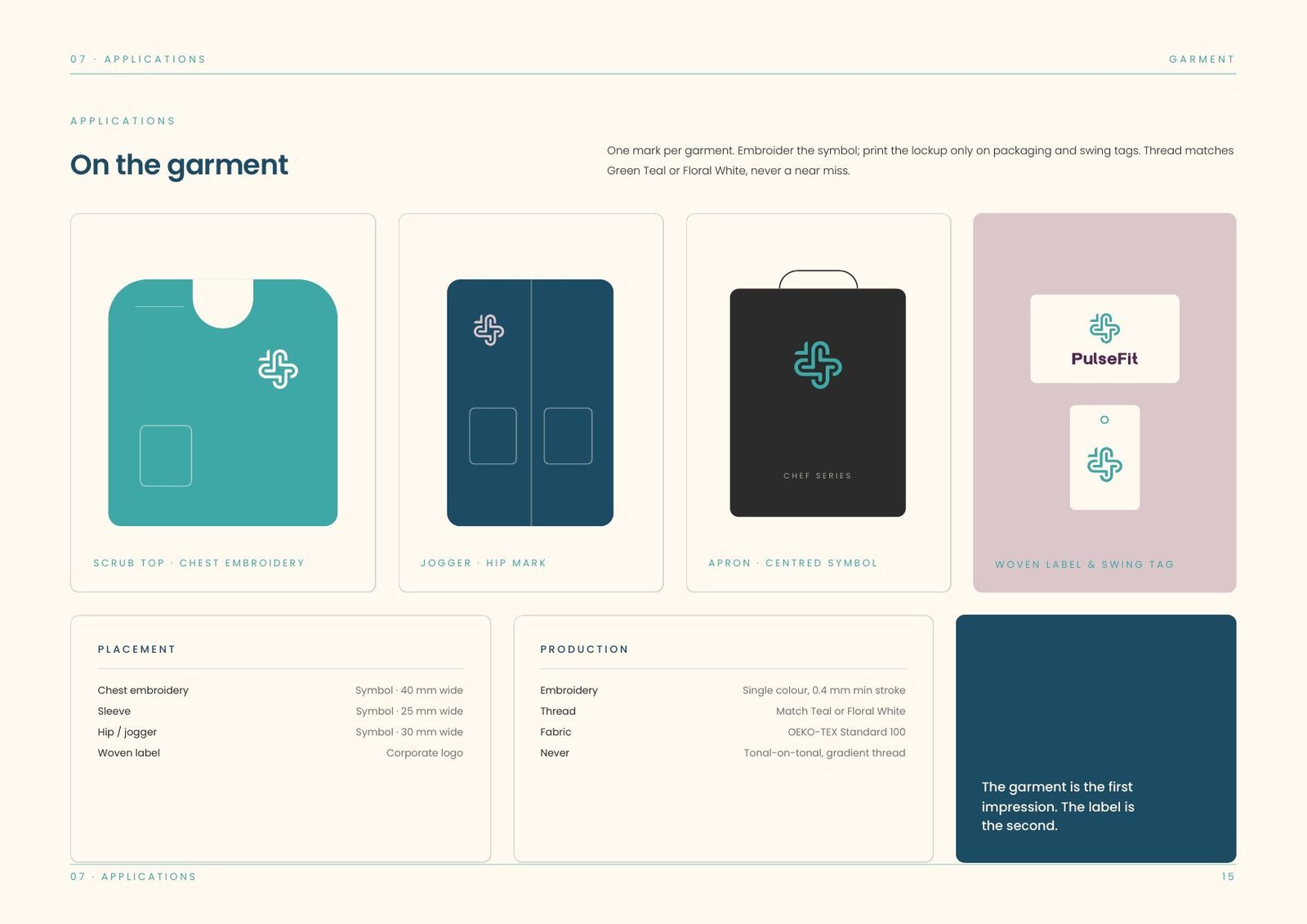
On the garment the rule is one mark per piece: the symbol for embroidery, the lockup for packaging and swing tags. Placement, thread and production are all specified: chest embroidery at 38 mm, sleeve at 30 mm, hip or pocket at 26 mm, single-colour thread only.
Off the garment, Floral White is the default surface everywhere, teal is the action colour on screen, and Indigo Dye is kept for reading and never used for a button.
Where a workwear brand gets judged.
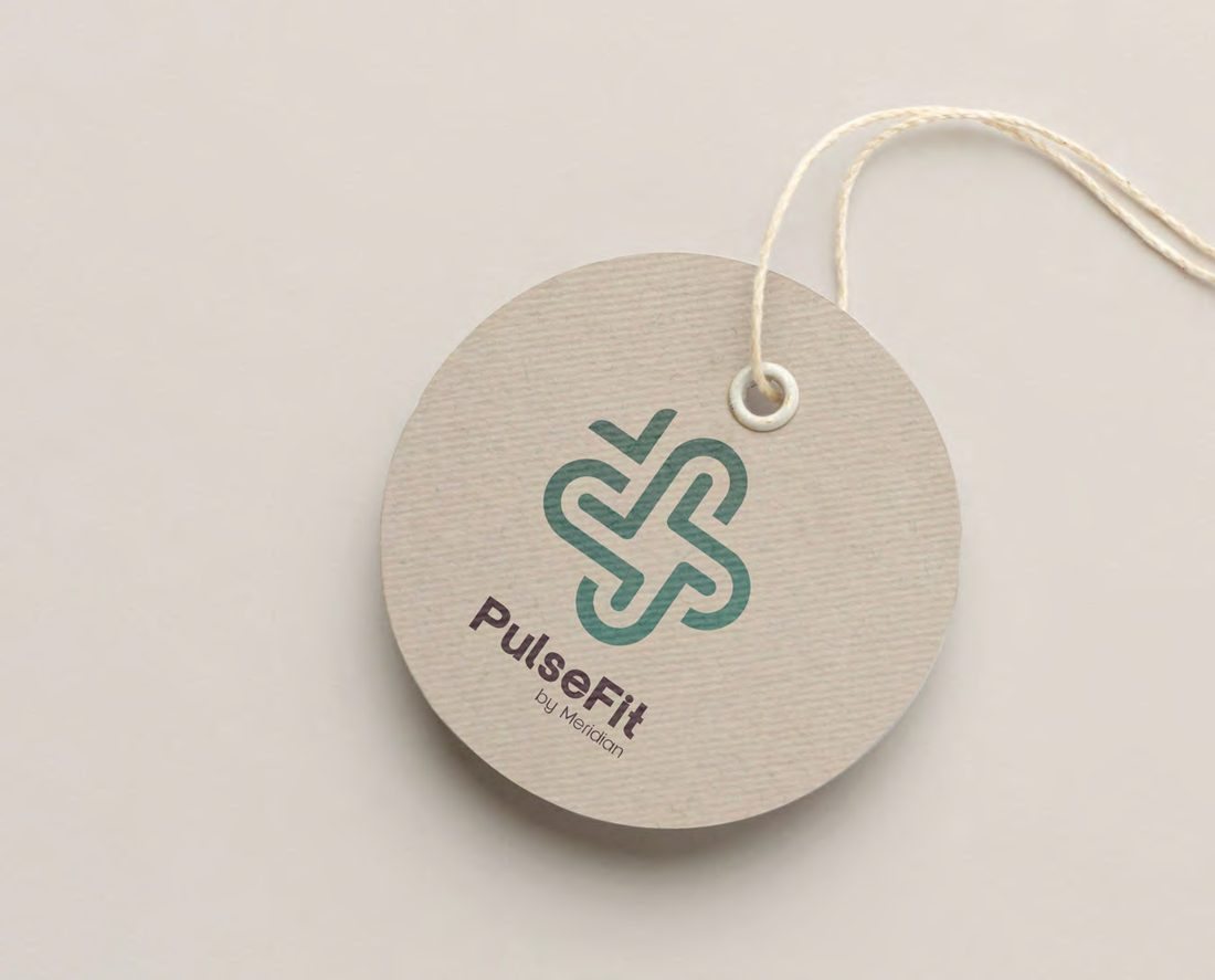
Uncoated board, rope tie and the symbol alone at tag scale, with no lockup or strapline. The swing tag is the one piece of the identity a wearer holds before they ever wear anything, so it carries the mark at its simplest.
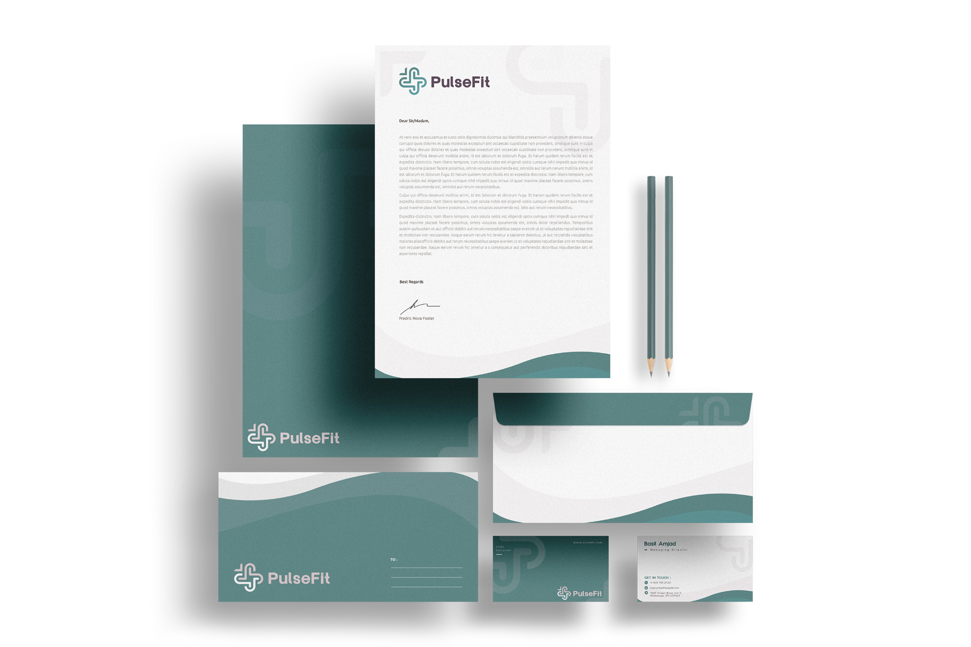
Pages across eight sections: brand, marks, colour, typography, voice, imagery, applications and assets.
Approved lockups, each with a named job: corporate, product primary, product secondary, and the symbol alone.
Colours: four primaries and three supports in a fixed proportion, with tints for garment ranges only.
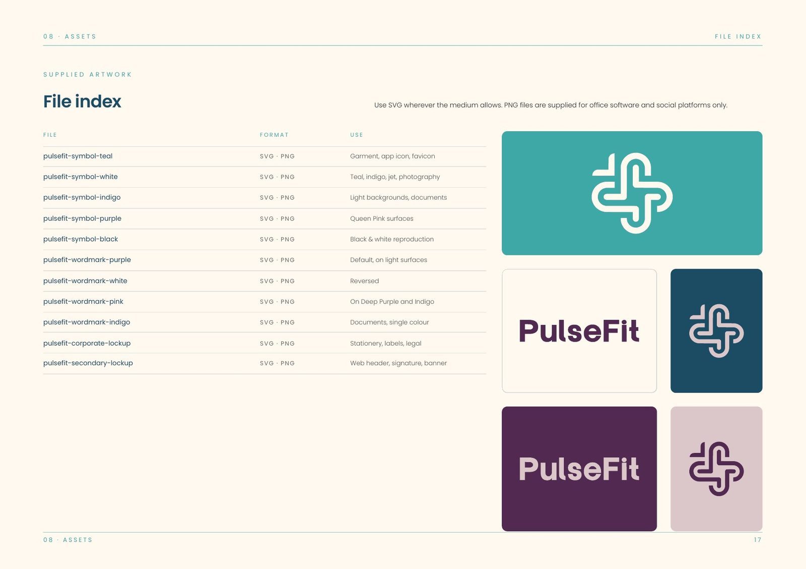
The book closes with a file index naming every supplied artwork by format and use: symbol and wordmark in each colourway, corporate and secondary lockups, SVG for anything that scales and PNG for office software and social platforms.
We are not selling uniforms. We are selling an experience.
Have a project like this?
Tell us what you are building. We reply to every enquiry within one working day.