Levante: Coffee, Chocolates & Flowers
A complete identity system for a Dubai house selling coffee, flowers and chocolates, three categories that are usually sold separately and often sold badly.
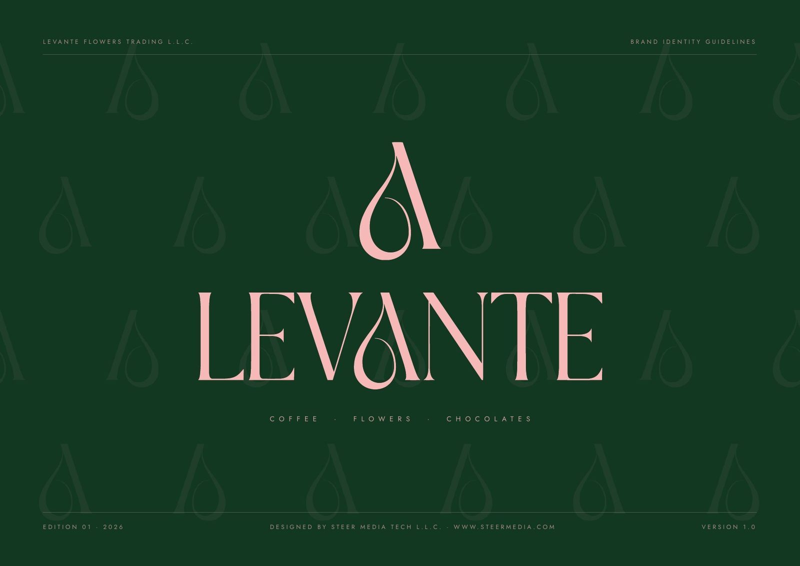
At a glance: the identity system, specified.
| Deliverable | Brand identity guidelines v1.0: 18 pages, seven sections |
| Categories | 3 (coffee, flowers and chocolates), carried by one mark |
| Mark | A drawn wordmark, plus a teardrop-A monogram for small sizes |
| Palette | 5 colours: Levante Green #123822 (PMS 5535 C), Blossom #F6B9B8 (PMS 700 C), Ivory #F5F0E8, Espresso #3B2A21, Antique Gold #C9A227 (foil 871 C) |
| Proportion | Green 60 · ivory 22 · blossom 14 · accents 4 |
| Typography | 2 typefaces: a high-contrast modern serif to speak, a geometric sans to inform |
| Minimum size | 24 mm in print, 96 px on screen; clear space of one cap height |
| Misuse rules | 8, each illustrated |
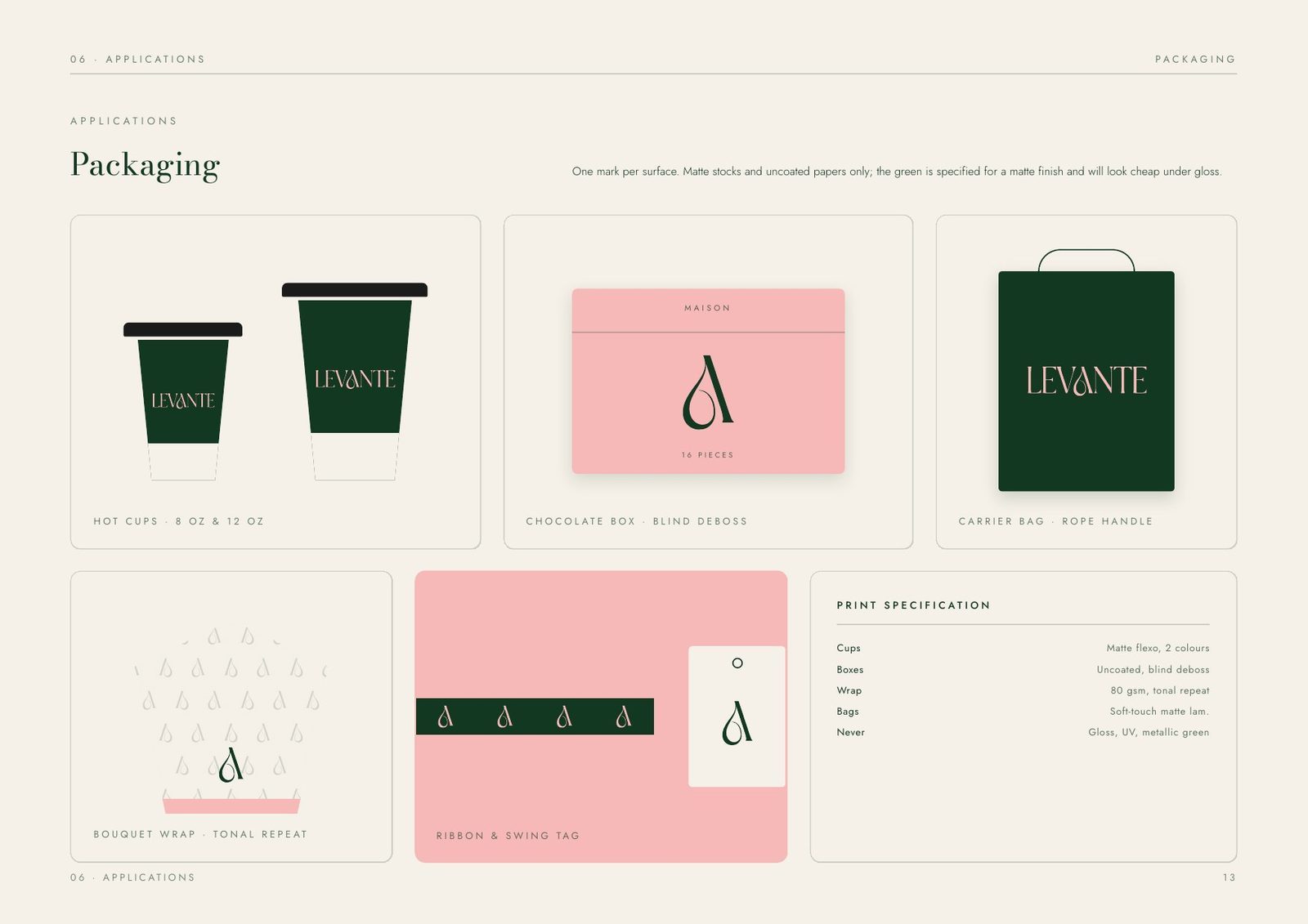
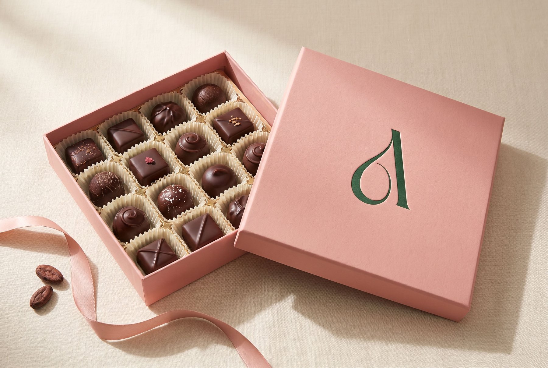
| Packaging | Matte and uncoated stocks only; 8 oz and 12 oz cups; a 16-piece gift box |
| Files | Logos as SVG and PNG, patterns as repeat tiles, with a file index for suppliers |
The challenge: three categories that refuse to sit together.
Coffee, flowers and chocolates are normally run as three businesses with three visual languages: a café chalkboard, a florist's script, a confectioner's foil. Levante sells all three across one counter, so three competing identities would have read as three shops sharing a lease.
What unified them was how they are bought, not what they are: all three are small, perishable, given as much as bought, and judged in the first three seconds. That framing set the standard for the identity and made Levante a gifting brand first.
The idea: quiet where the product is loud.
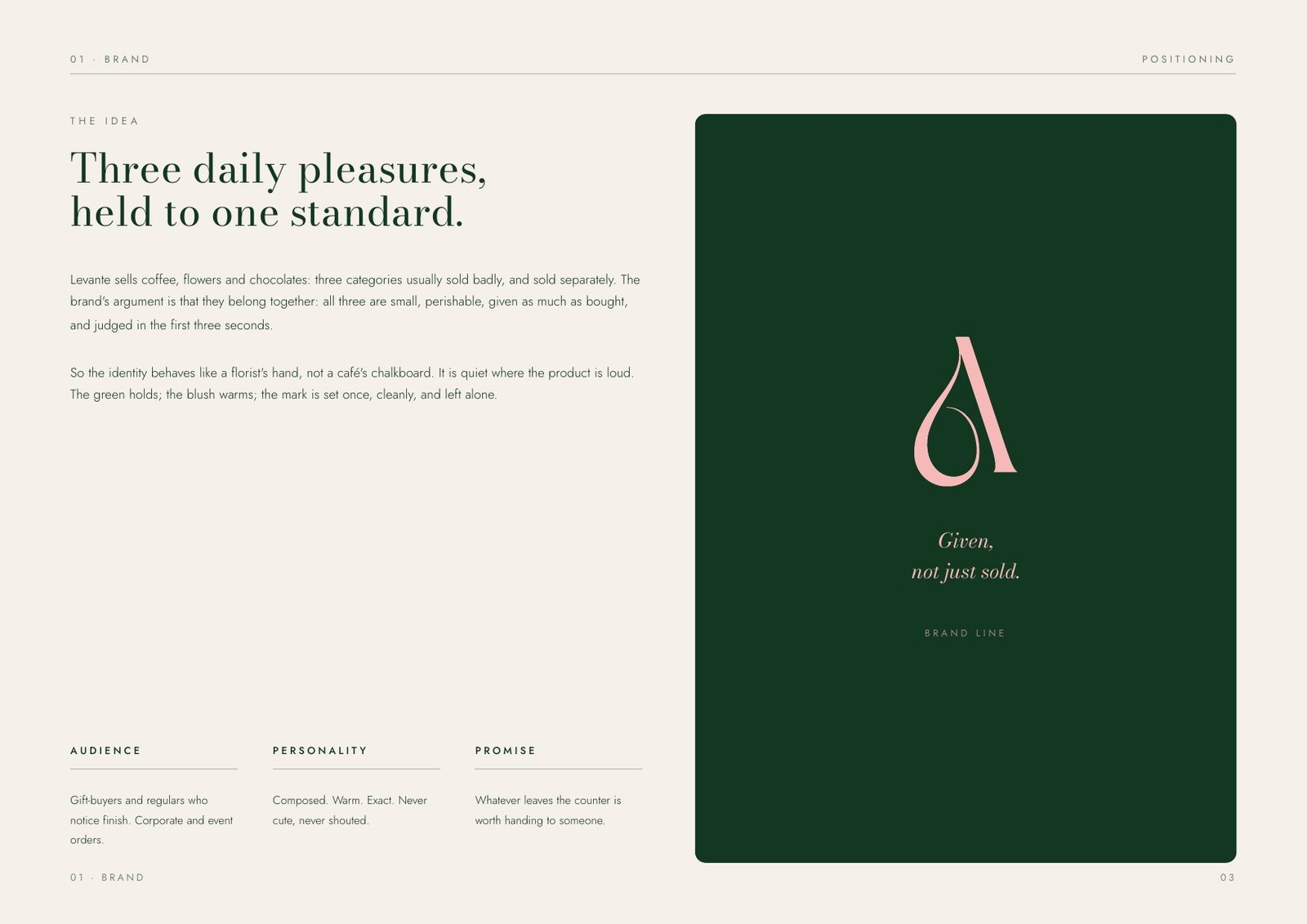
The identity behaves like a florist's hand, not a café's chalkboard. The green holds, the blush adds warmth, and the mark is set once and left alone, because the product on the counter is already the loudest thing in the room.
Everything downstream answers to one line: whatever leaves the counter is worth handing to someone.
Audience
Gift-buyers and regulars who notice finish, the customers who turn a box over before they hand it on. Corporate and event orders too.
Personality
Composed, warm and exact. Never cute and never loud, like a house that trusts its product to do the selling.
Promise
Whatever leaves the counter is worth handing to someone. The test every application, from a cup sleeve to a shopfront, has to pass.
The mark: a teardrop hidden in an A.
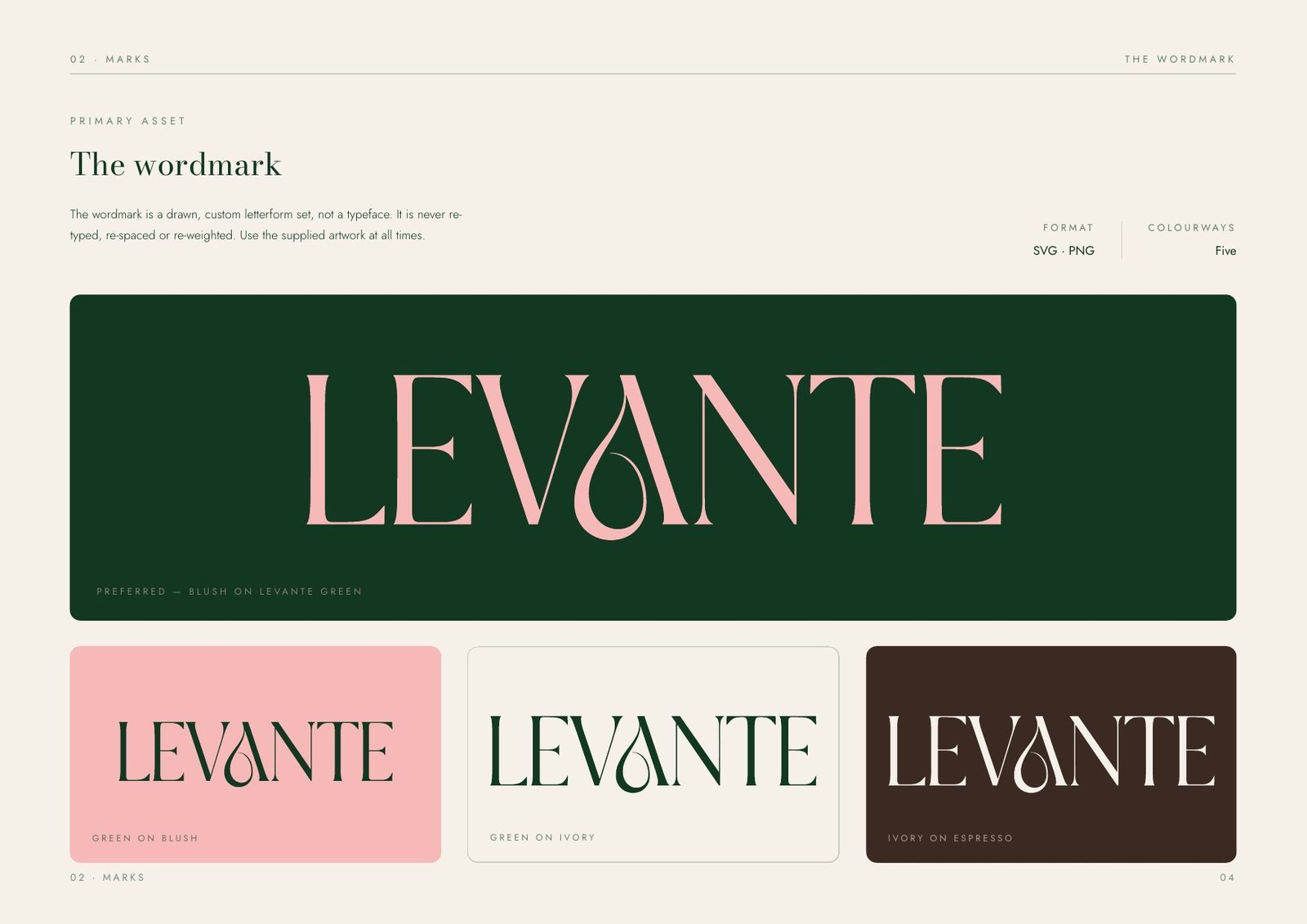
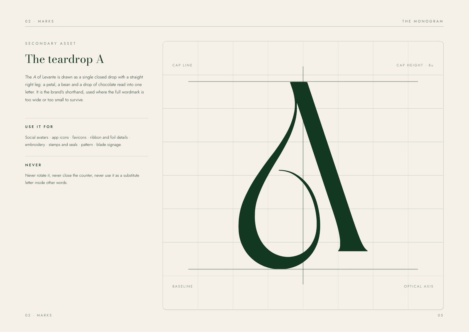
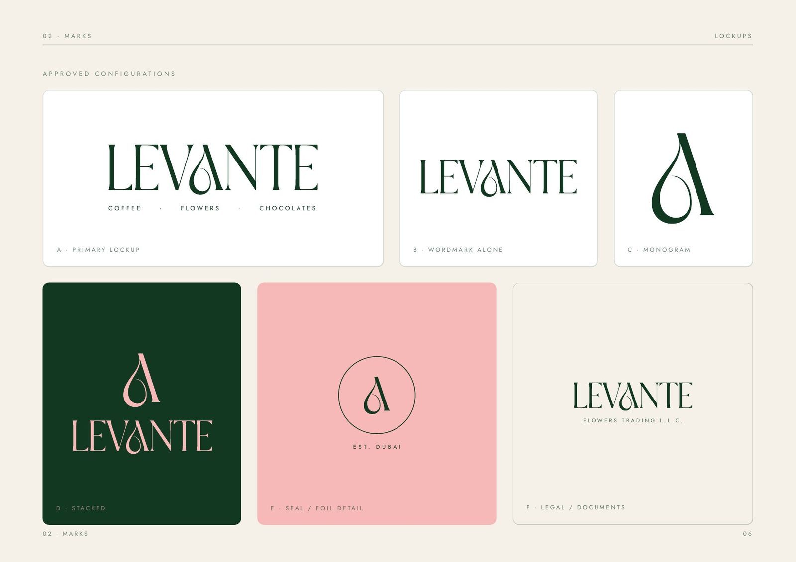
The wordmark is drawn, not typed: a custom letterform set from a modern serif, supplied as artwork and never re-set. Inside it, the A carries a teardrop counter that reads as a petal, a bean and a drop of chocolate, so one mark can stand for all three categories without illustrating any of them.
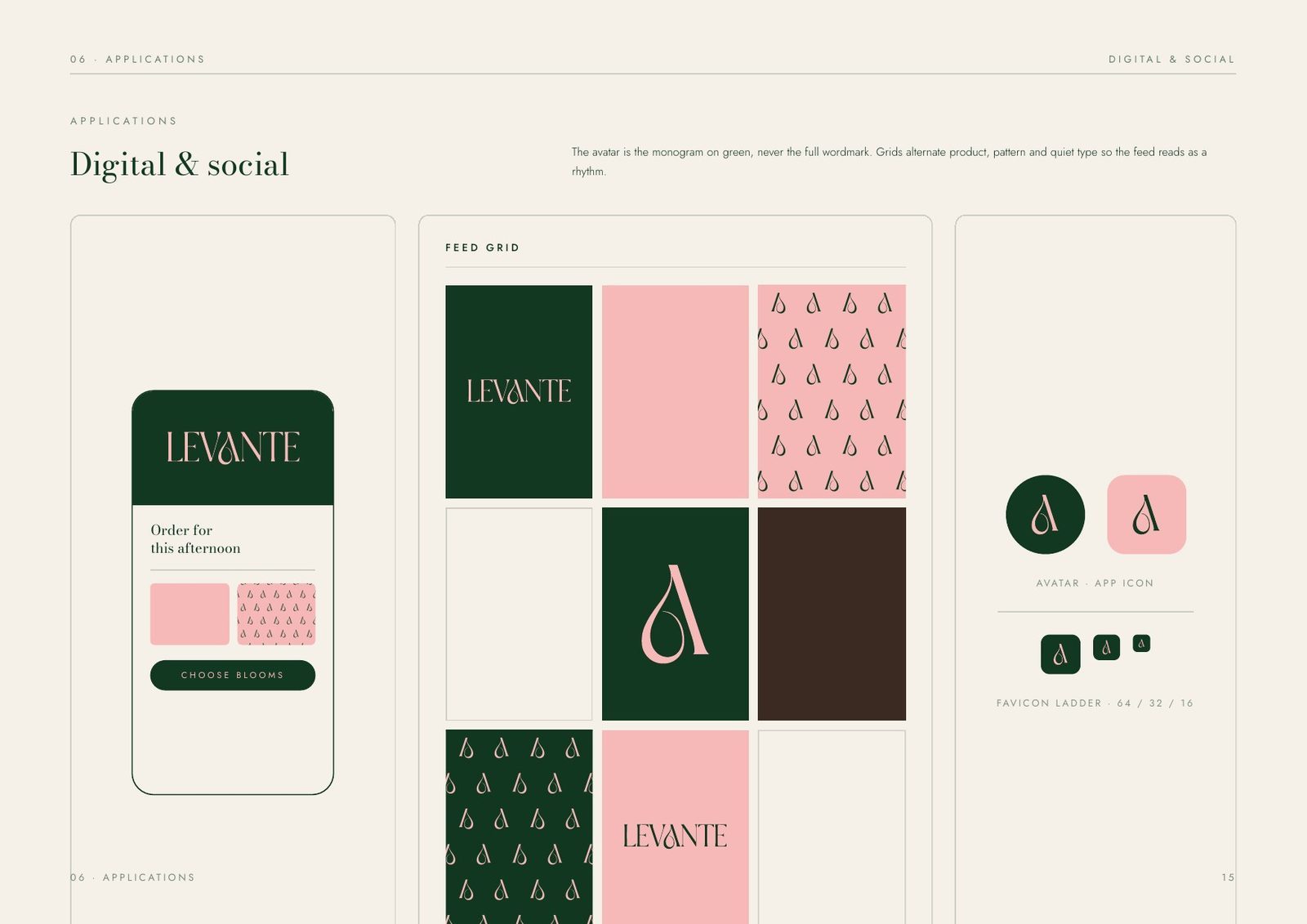
That monogram detaches and works alone at small sizes, where the full wordmark would break down: social avatars, app icons, stamps, seals, wax and ribbon.
Primary wordmark
Blush on green as the default lockup, with single-colour cuts on blush, ivory and espresso for print and documents.
The teardrop A
The secondary asset, used where the wordmark is too small to hold up. Never traced or redrawn.
Clear space & scale
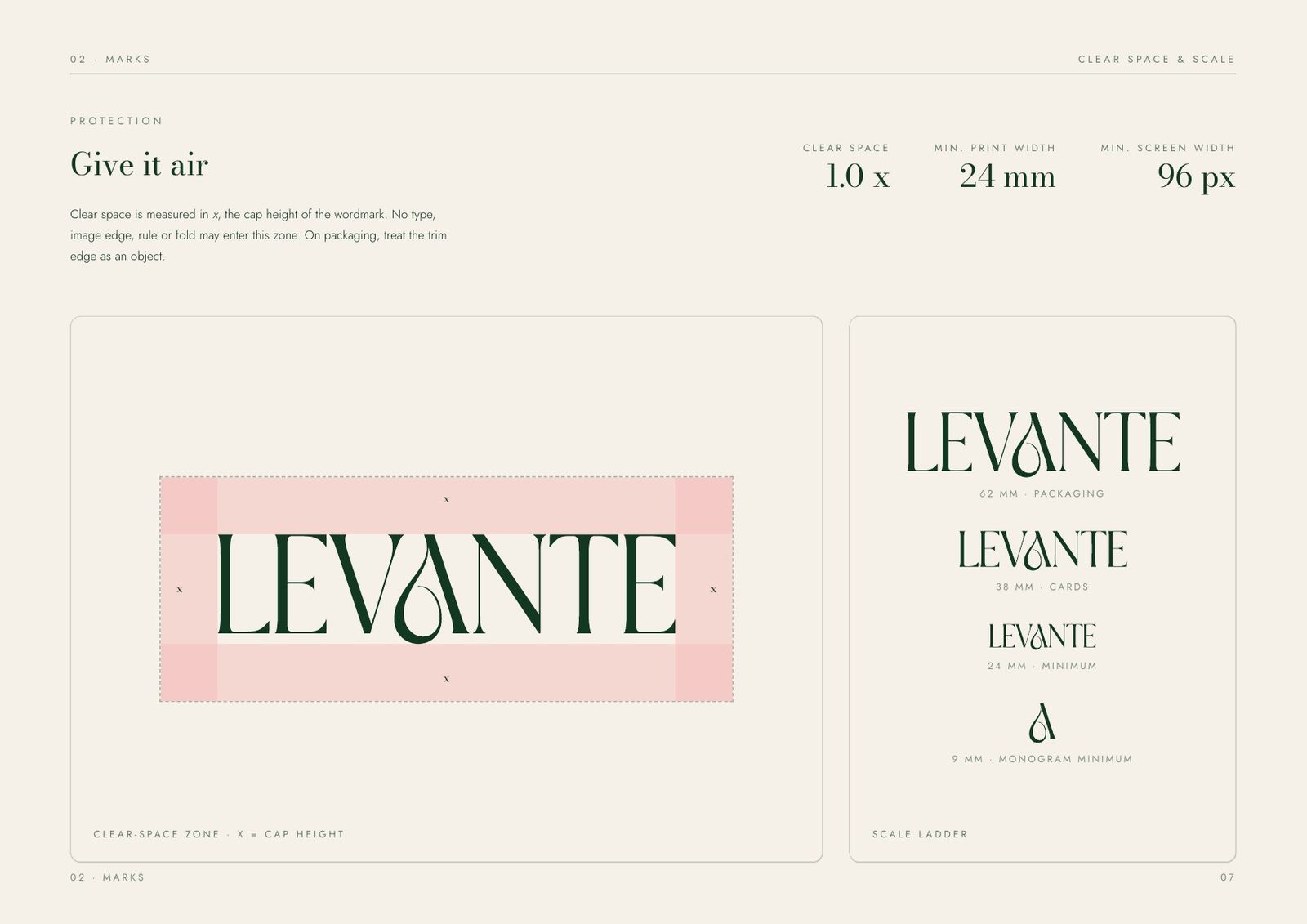
Clear space of one cap height on all four sides. Minimum 24 mm in print, 96 px on screen. Any smaller and the counter closes up.
Eight ways to break it
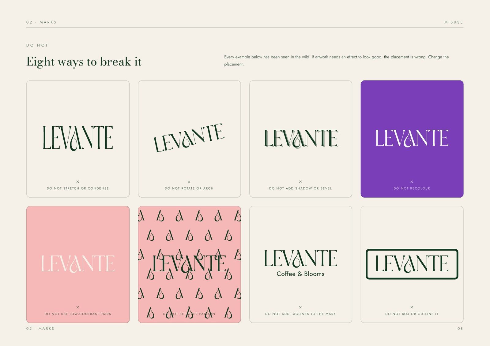
Stretching, re-colouring, outlining, shadowing, re-typing, patterning behind it, adding a strapline, boxing it in. Each one is shown, so nobody can argue with the rule.
Colour: two colours, three neutrals, nothing else.
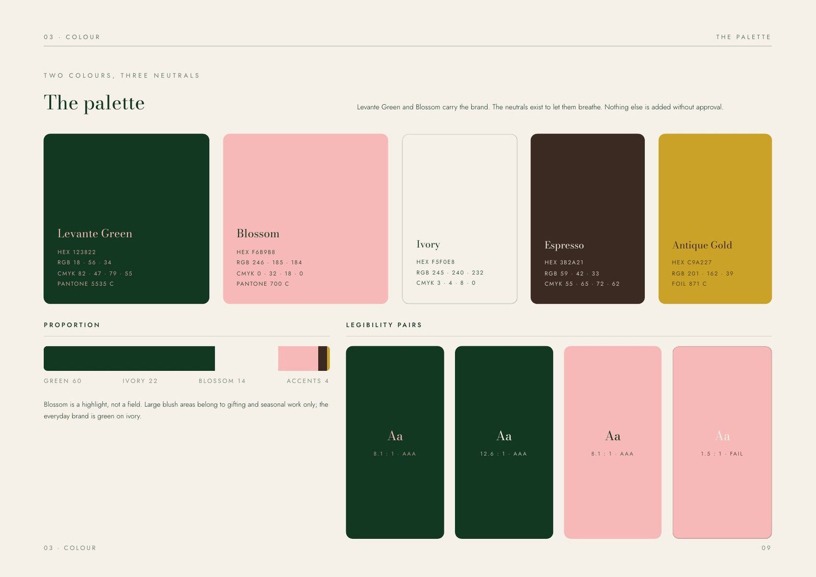
Levante Green and Blossom carry the brand; the neutrals exist to let them breathe. The discipline is in the proportion more than the palette: green 60, ivory 22, blossom 14, accents 4.
Blossom is a highlight, not a field. Large blush areas belong to gifting and seasonal work only; the everyday brand is green on ivory. Every pairing was checked for contrast, and the one that fails (blush type on blush) is documented as a failure so nobody ships it.
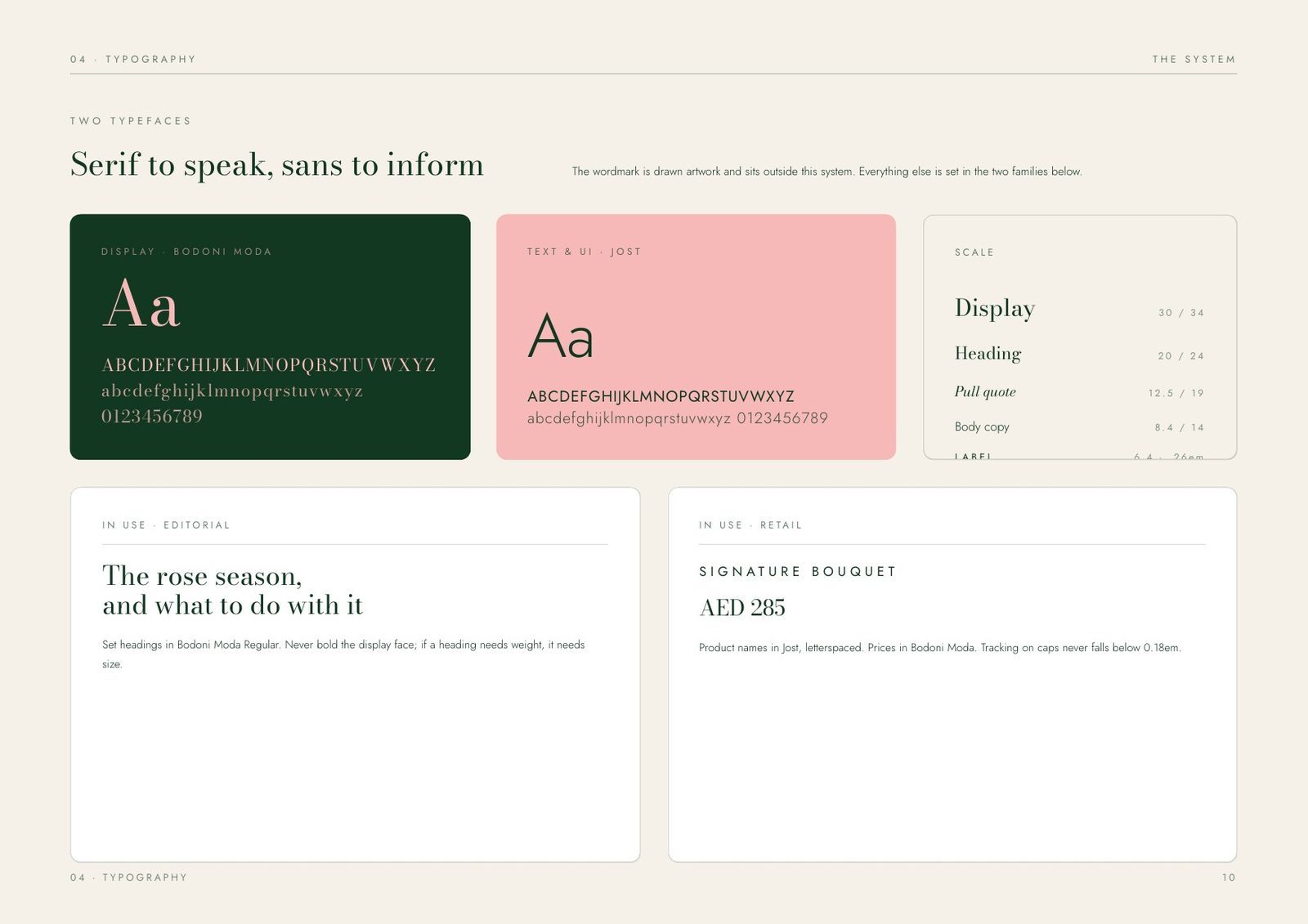
The system: serif to speak, sans to inform.
Two typefaces, split by job. A high-contrast modern serif carries display and headings and gives the brand its voice. A geometric sans handles everything that has to be read: pricing, ingredients, care notes, terms.
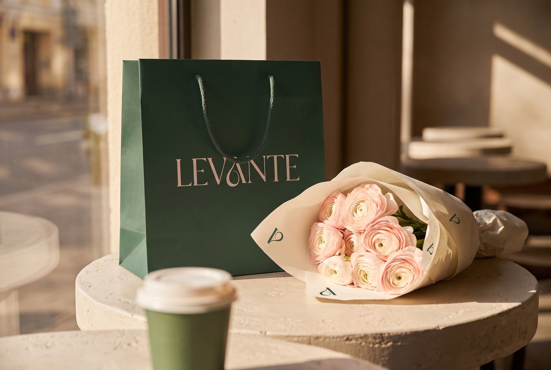
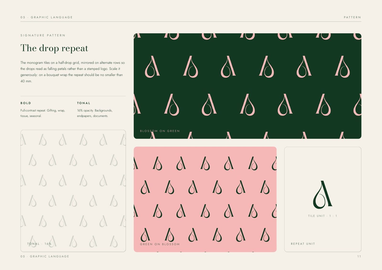
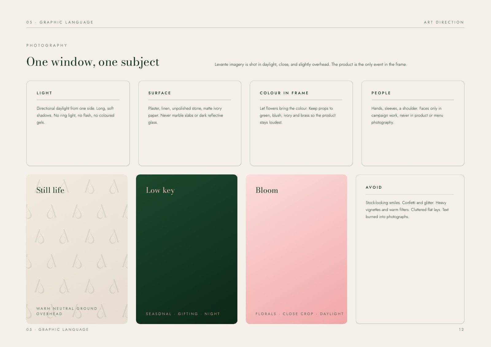
Beyond type, the system has two more instruments. The drop repeat turns the monogram into a half-drop pattern for wraps, tissue, bags and liners, bold on green and tonal on ivory. The photography rule fits in one line, one window, one subject: directional daylight on one clean surface, shot close and slightly overhead.
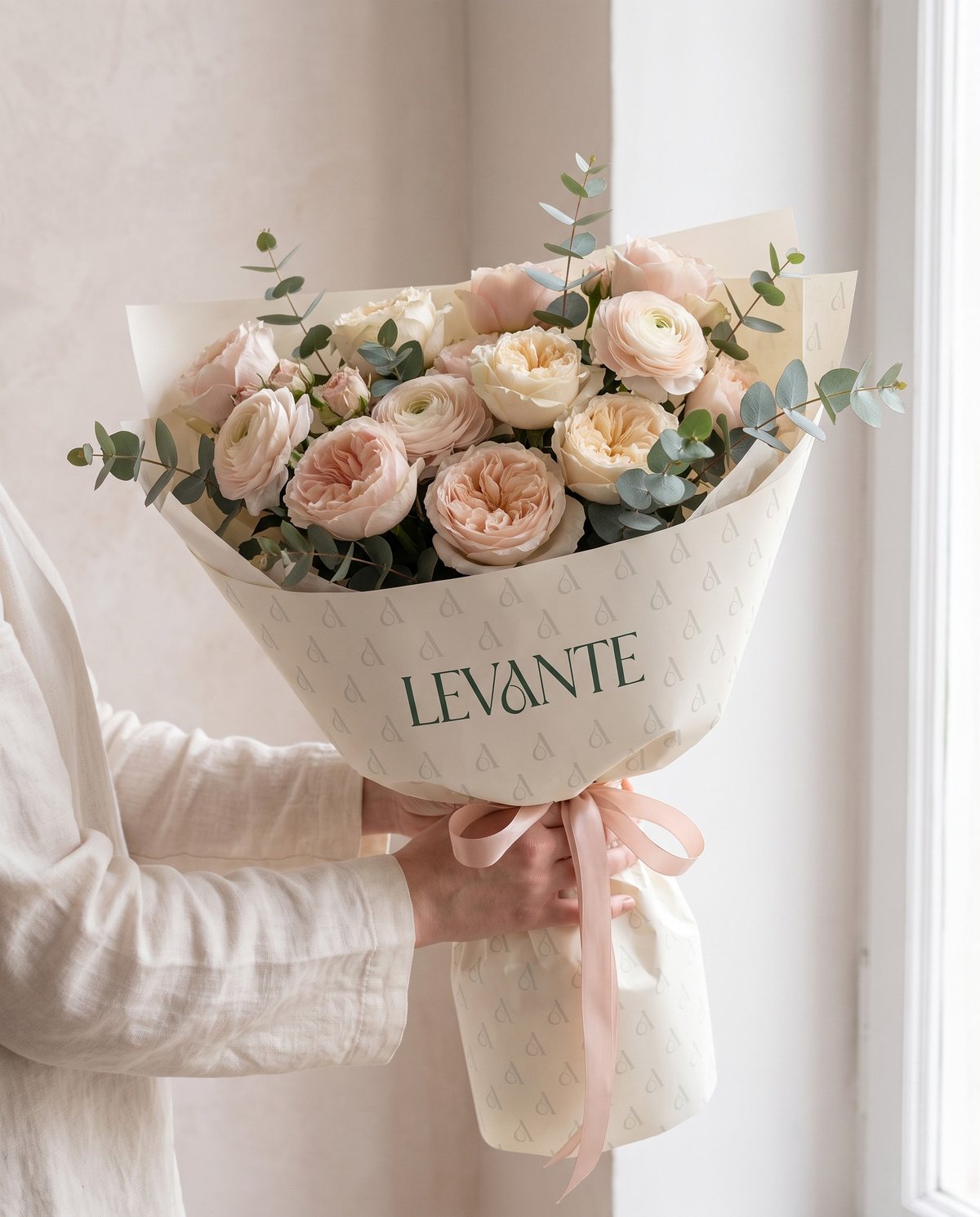
Tonal on ivory, so the flowers stay the loudest thing in the frame.
Bouquet wrap prints the monogram as a half-drop at low contrast. Close up it reads as texture more than branding. That is deliberate, because the pattern has to survive being handed over, photographed and thrown away.
Applications: where the standard gets tested.
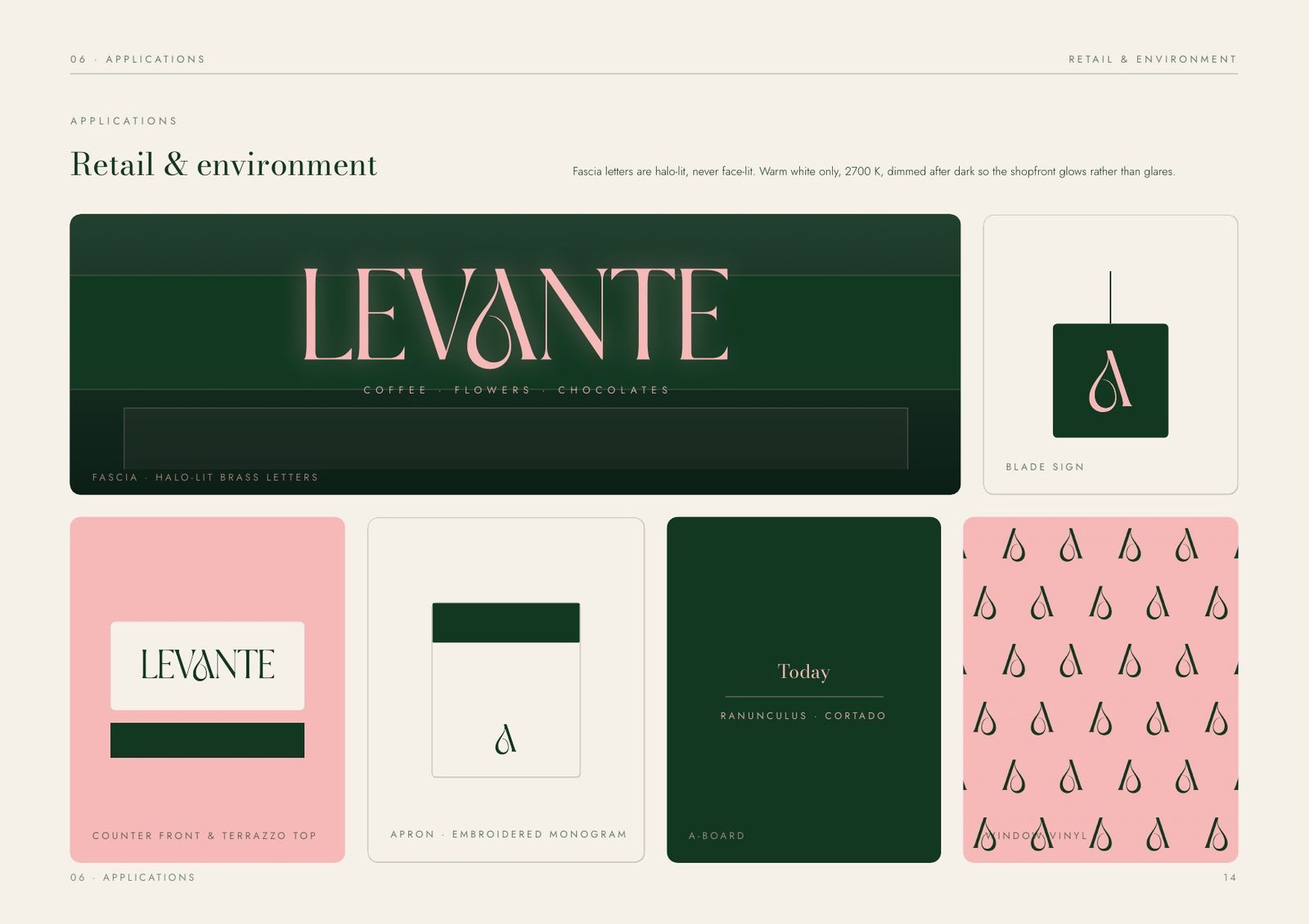
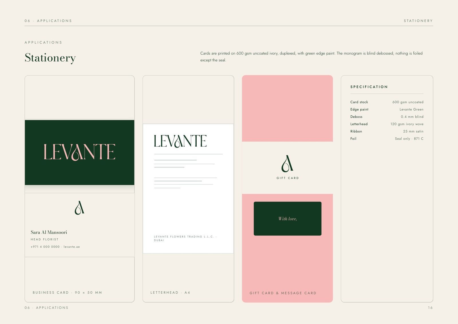
A gifting brand is judged at the moment of handover, so the system was specified where it touches the customer: hot cups and chocolate boxes, bouquet wrap and ribbon, the shopfront and the apron, the feed grid and the app icon, the business card and the note card that goes inside the box.
Packaging follows one rule: one matt uncoated surface, matte stocks and uncoated papers only, with the green specified for a matte finish so it will not look cheap under glass. Print specifications, stocks, weights and finishes are named rather than described, so a supplier can quote from the book.
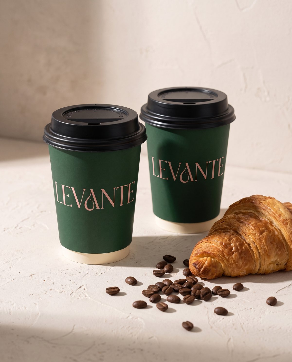
The application that leaves the counter most often.
Eight and twelve ounce, matte green, wordmark set once at a fixed height on both. There are no secondary marks, no strapline and no seasonal variant. The cup is the brand's most-repeated impression, so it changes least.
Pages across seven sections: brand, marks, colour, typography, graphic language, applications and assets.
Categories (coffee, flowers and chocolates) carried by one mark instead of three sub-brands.
Colours in total, with a fixed proportion, contrast pairs tested and one documented failure.
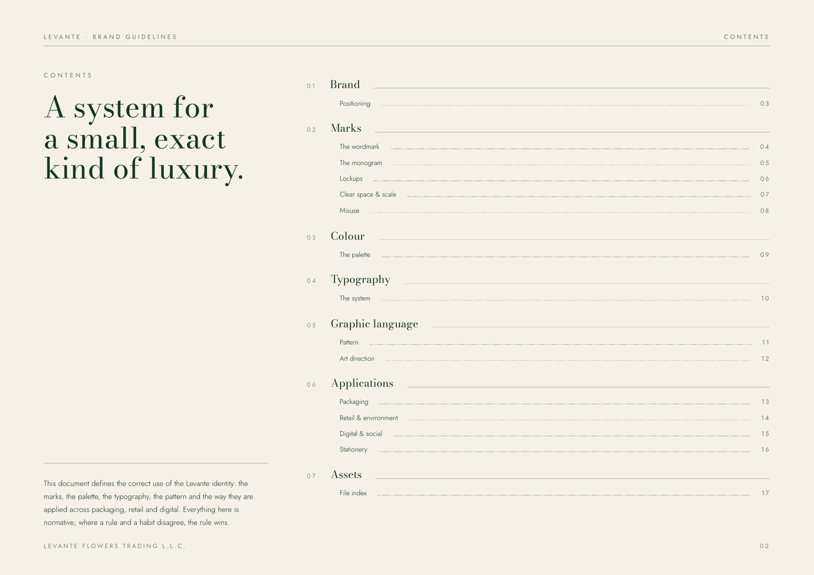
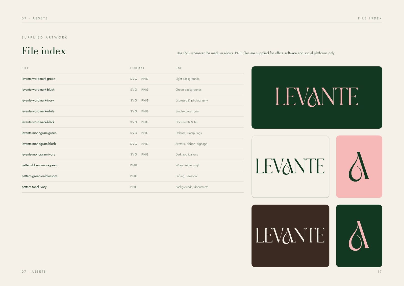
The book closes with a file index that lists every supplied artwork by filename, format and use, so the right file goes to the right supplier without a phone call. Logos ship as SVG and PNG; patterns as repeat tiles; each entry states where it may and may not be used.
It is quiet where the product is loud.
Have a project like this?
Tell us what you are building. We reply to every enquiry within one working day.