Designing brand systems that survive a billboard and a six-second pre-roll
A logo is the easy part. Building an identity that holds up from a 20-metre hoarding to a muted bumper ad takes a system that is fixed where it must be and flexible where it can be.
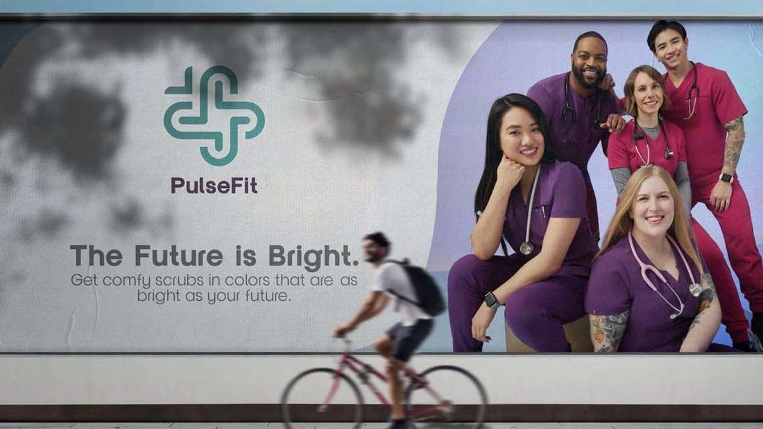
A brand no longer lives in one place. The same identity has to work at twenty metres on a roadside hoarding and at four centimetres in a muted feed; as a static press ad and as six silent seconds before a video someone came to watch. Design a single, precious logo for that world and it will break somewhere. What survives is a system.
The old deliverable (a logo, two colours and a font in a PDF) was built for fixed formats, and most of those formats are gone. The brief now is closer to engineering: define what must never change, define what's allowed to move, and make the difference explicit enough that anyone can build on it without eroding it.
Fixed, flexed, free
The cleanest way we've found to think about it is a three-tier system, an approach studios like Jones Knowles Ritchie have made almost standard:
- 01Fixed.The non-negotiables: the symbol, the wordmark, the core colour, the primary typeface. These carry recognition and never bend. They're what make you you at a glance.
- 02Flexed.Elements that adapt within set rules: a secondary palette, seasonal treatments, illustration styles, motion. Room to feel fresh without feeling like a different company.
- 03Free.Space left open on purpose for expression, such as campaign-led art direction, collaborations and one-offs. The fixed layer keeps it anchored.
Consistency isn't sameness. It's a small set of things that never change, doing the heavy lifting while everything around them is allowed to move.
Design for the hardest format first
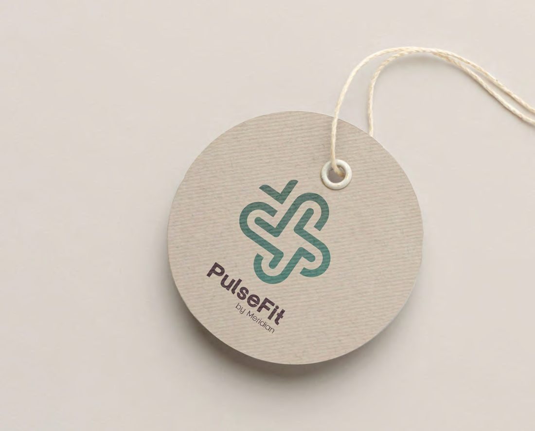
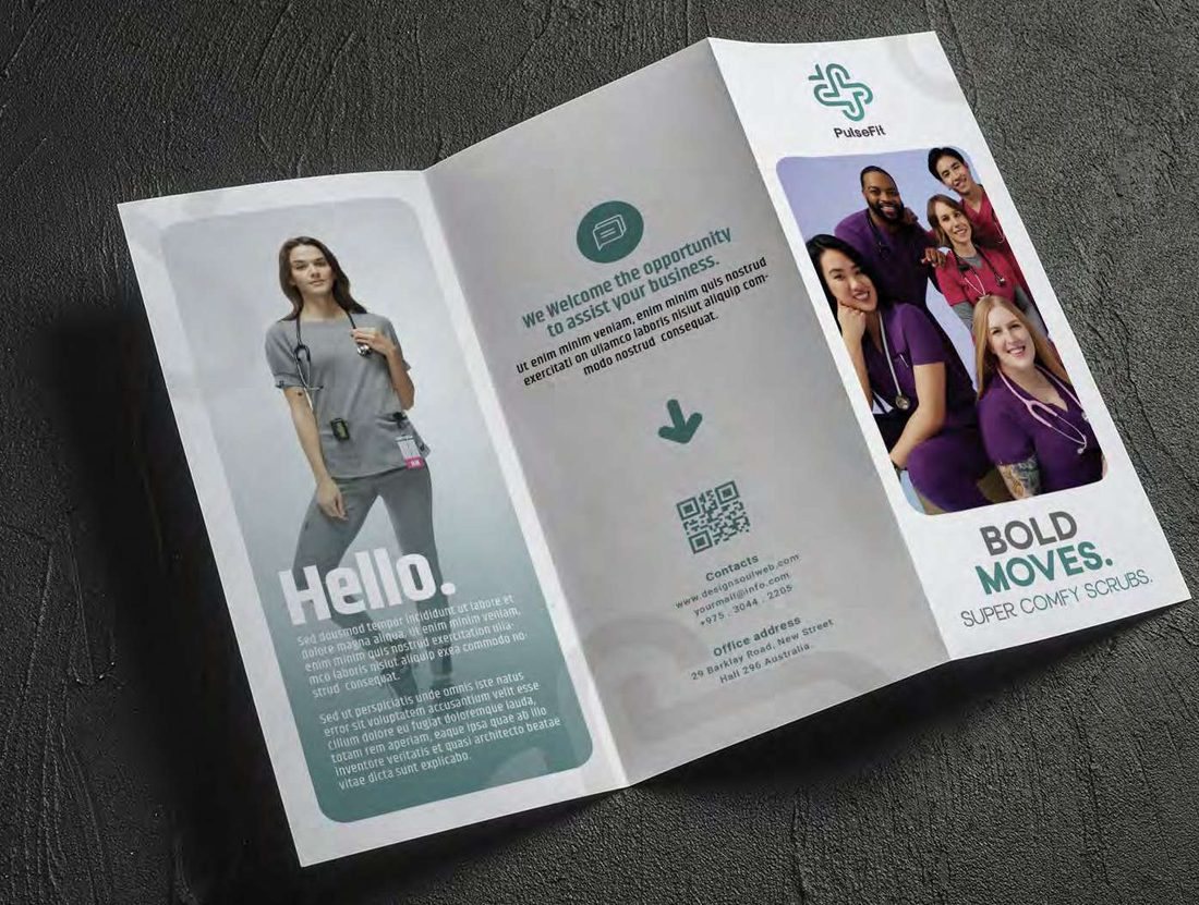
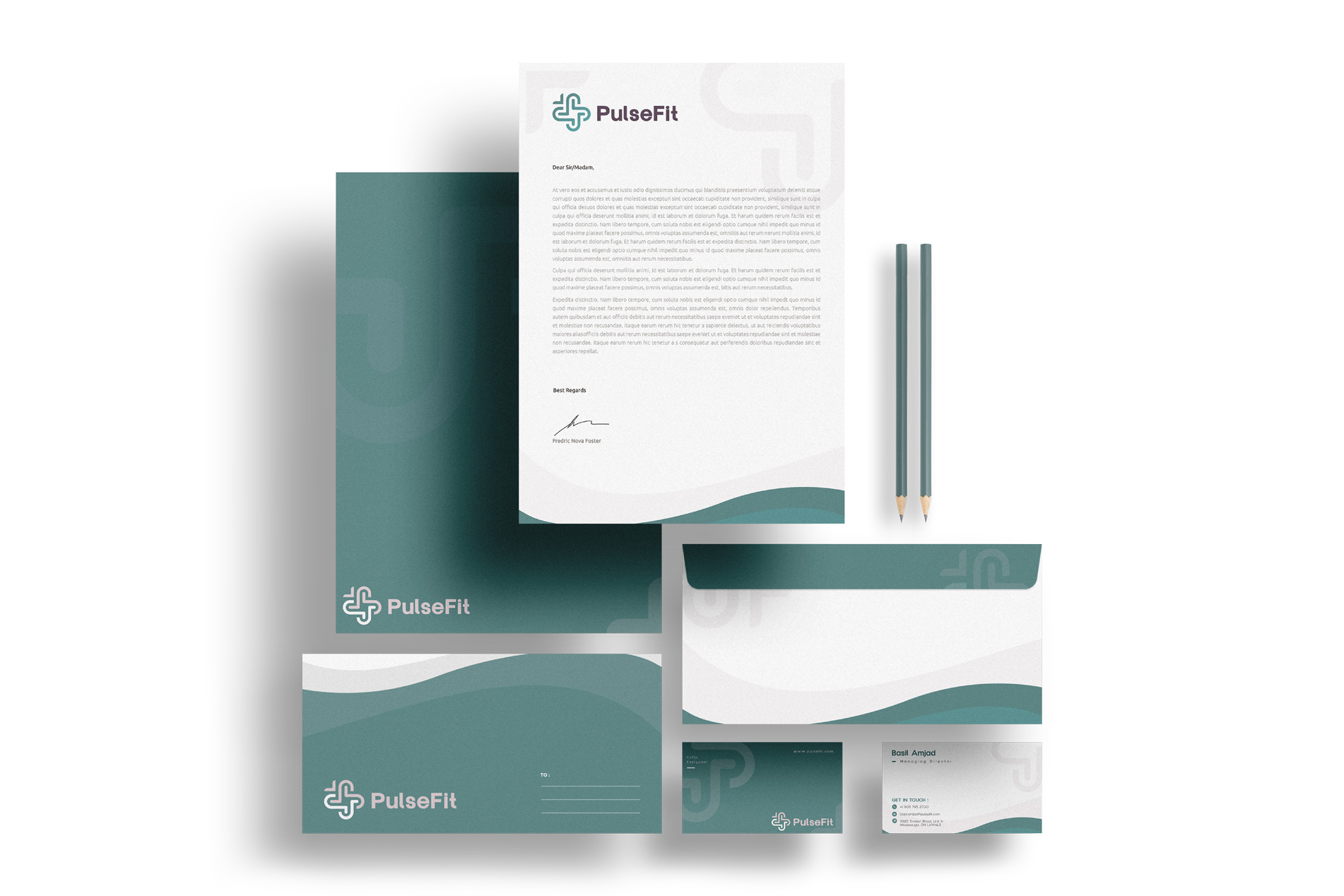
Most identities are designed at a comfortable size on a nice screen and then squeezed down until they fail. We invert it. If a mark has to survive a six-second bumper that is muted, skippable and barely glimpsed, then simplicity and instant legibility are the brief. A responsive logo is really a family: the full lockup for room to breathe, a compact mark for tight spaces, a single glyph for an app icon or a favicon. Google's letterforms stay put while the expression around them changes constantly.
The same logic runs through the whole toolkit. Variable fonts let type shift weight and width to the context while staying unmistakably the same typeface. Distinctive assets such as a colour, a shape, a sound or a motion signature do the recognition work when the logo is too small to read or gone entirely. In a muted, thumb-speed feed, those assets are often the only thing carrying the brand at all.
Building or refreshing a brand?
Tell us about the brand and where it has to work. We reply within one working day with a scoped quote.
The risk of too much freedom
Flexibility has a failure mode: a system so loose that nothing looks like itself twice. Without a fixed core you end up with a mood board that resets every campaign. The discipline is knowing what to hold. Keep the fixed layer locked and you can afford a wide range everywhere else, because the few constants do the remembering for you.
Build the guardrails, then the work moves fast
A good system lets a brand move quickly without a committee. When the rules are clear about what's fixed and what's free, a social designer, a film editor and an OOH team can all work fast and still end up in the same place. That is the point of the exercise: a brand that stays coherent from a billboard to a pre-roll, at the speed the feed demands.
Building or refreshing a brand?
Tell us about the brand and where it has to work. We reply within one working day with a scoped quote.